Lookout360 settings page
Lookout360 is a toolbar that is placed at the top of web pages to let users post, monitor and respond to stream items from any page. It has configuration to turn it on across a SharePoint farm via Central Admin, and it can also be implemented on other web pages (for example, a legacy intranet site) via JavaScript.
The goal is to provide users with the count of unviewed items from most of their tiles, an easy way to view the items from their tiles and respond to them, and an easy way to post to the stream. Though the feature is called Lookout360, the displayed name can be changed in Central Admin.
Below are some screenshots.
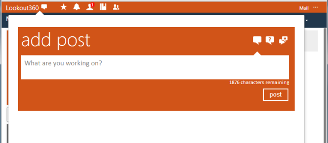
Users can create microblogs, questions and private messages from this control.
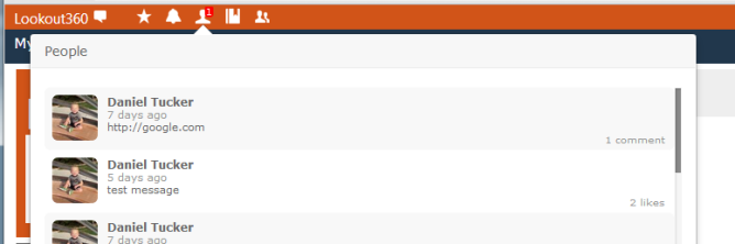
Users can view counts from tiles they have configured in Lookout, see the items for those tiles, and respond to them.
The toolbar also allows significant customization including choosing links to display and layout. The toolbar requires IE8 or higher (this is what allows it to work across multiple websites securely).
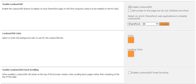
Lookout360 has extensive controls in Central Admin to configure it. All the settings are found in the Lookout360 Settings menu in the User Experience section of the NewsGator Social Platform service.
Lookout360 Settings
The first section of settings (Enable Lookout360) controls whether and where Lookout360 shows.
The Enable Lookout360, turns on Lookout360 across your SharePoint farm. This causes the toolbar to display on nearly every page (excluding some administrative and editing pages.)
The option Add scripts to the page but do not initialize and show is so that customers can more easily take advantage of the functionality in the Lookout 360 code for their own custom development (for example, using just the Lookout360 search capability).
You can prevent the Lookout360 bar from appearing on certain web applications using the Select on which web applications to disable Lookout360 dropdown.
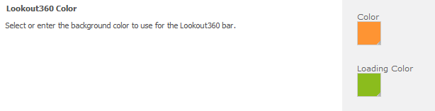
The Lookout360 Color, allows you to pick the background color that the Lookout360 bar has while it is loading, and to pick a separate color for it to have after it has completed loading. Choosing a different loading color will give users a clear visual cue on when Lookout 360 has completed loading.
The color control allows picking from a few preset choices or entering a hex code for a specific color.
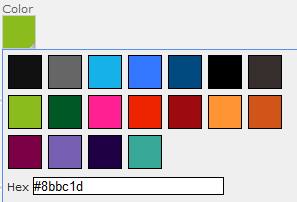
Pick a color or enter a hex code for a specific color.
Below is an example of what users see. In this example, green is selected for loading while orange is selected for display.
Green is selected for loading and orange for display
This results in a brief display of a green bar as the Lookout360 bar is loading at the top of a page.

Green bar
This is quickly followed by the actual orange Lookout360 bar.

Actual orange bar
The Enable Lookout360 Fixed Scrolling setting keeps the Lookout360 toolbar on the screen, always visible to the user, regardless of whether the user has scrolled down the page or not.
This fixed scrolling behavior can be helpful if you think users will frequently be scrolling down the page but still wanting access to the toolbar. Note that this setting is really only important for deploying this to sites besides SharePoint – on SharePoint, this behavior happens automatically.
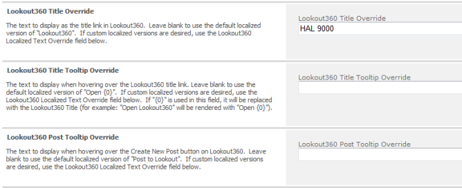
The next three controls allow specifying text to display for title and tooltips.
controls for specifying text to display for title and tooltips
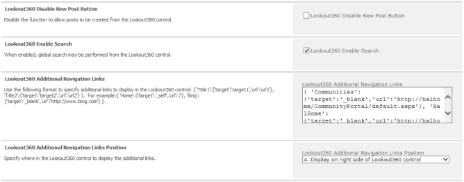
The next controls determine whether the post control displays, whether the search box is visible, the positioning of elements on the bar, and display of additional links within the bar.
Controls for displaying post controls, search box, positioning of elements, display of additional links
Beginning in the 5.2 release, a new option has been added in the Lookout 360 settings in Central Admin. The Lookout360 Additional Navigation Links Display causes the additional links to show in column on click versus being laid out horizontally on the bar.
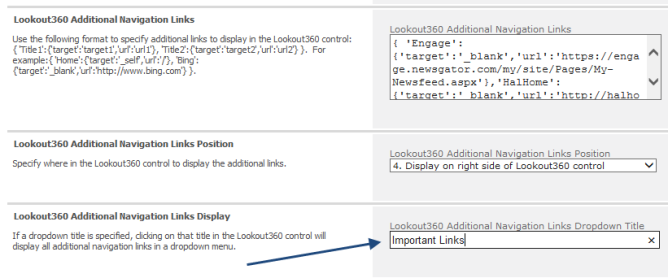
Lookout360 Additional Navigation Links Display
When the dropdown title is specified, the Lookout 360 bar now displays with a single title entry. Clicking this provides the user with a dropdown displaying all the specified navigation links.
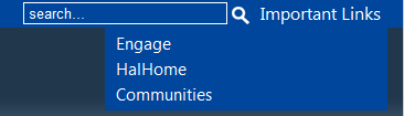
Additional navigation links
The implemented behavior here is an on-click behavior to display the dropdown. If a customer wants an “on hover” behavior to show the dropdown list, it can be done with a simple javascrcipt/css customization.
The last two settings control how frequently the toolbar checks for updates (default is two minutes) and provide a way to localize the display name and the tooltips.
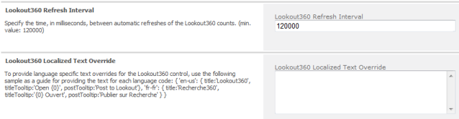
Controls the frequency of updates