Choice Site Column
A choice column allows you to display a limited list of valid values from which the user can make a selection. Additionally, you can determine how the choices are displayed to the user. This provides consistency across sites when it is a column that will be used in multiple environments.
To configure a choice site column, enter a name in the Column name textbox and complete the common properties. Then complete the additional column settings unique to this type of column and, optionally, the column validation settings.
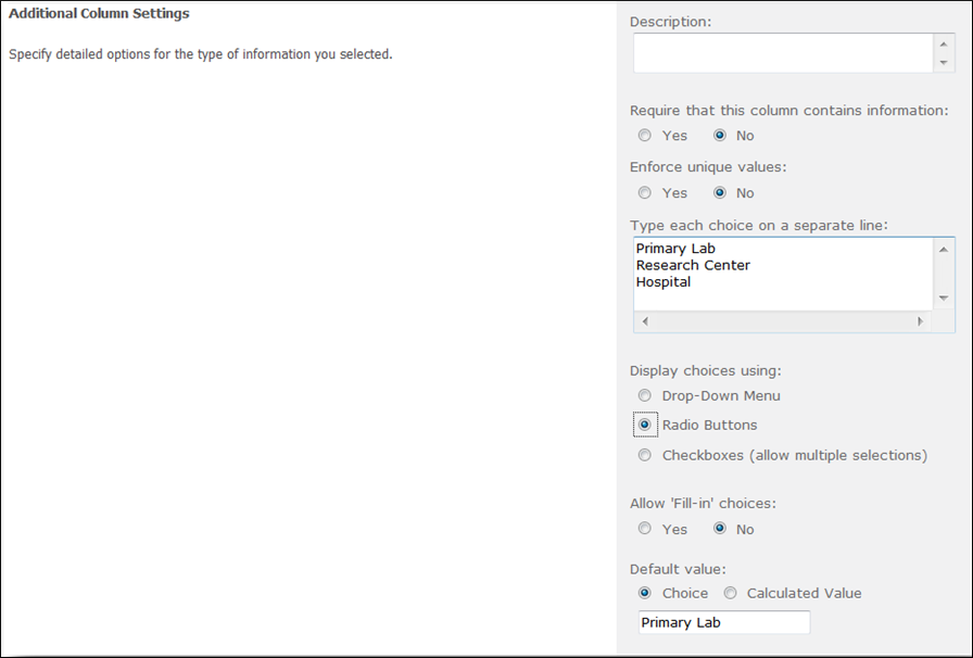
Additional Column Settings unique to a choice site column:
- Enter the choice options in the textbox making sure that each choice is on a separate line.
- Display choices using determines how the choices will be displayed. By default this is set to “Drop-Down Menu”. The options are:
- Drop-Down Menu,
- Radio Buttons, and
- Checkboxes (allow multiple selections).
- Allow Fill-in Choices designates whether the user can type in a value that is not in the pre-defined set.
- Default Value allows you to designate a value that will be set as the initial value for the column.
Note that in the Default value textbox, the first entry on the choice list will be the default. If you do not want a default to be displayed, clear the entry from the Default value textbox.