Edit Control
The Edit control defines the contents of the Edit view when creating new records (Edit control in New mode) and when updating existing records (Edit control in Update mode).
If no Edit control is defined for an info area, the Details control is used as a fallback.
You can define the following:
- The header text "Edit Details" uses text no. 1 from text group
Details_core. - You can group the fields on the control by defining group panels
(
 ), see Panels.
 - The panel's Label is displayed as sub-heading for the group, e.g. "General Information", "Company Details", etc.
- Add fields and set their attributes as in Aurea CRM web, see Customizing a Control in the Aurea CRM web Administrator Guide.
- When using hierarchical catalogs, ensure that both the parent and child catalog fields to the control were added. Users need to save the record before being able to select a value from a child catalog.
- For detailed information on all available input controls used for the different field types (Boolean, catalog, date, etc.). For more information on input types, see the article “How To configure expand edit mode” at https://support.aurea.com.
- Combined fields are displayed separately in Edit mode.
- Z-fields without a Select-Function are automatically hidden in Edit mode.
The Edit control is used when you assign the following actions:
- EditView (e. g. for new records)
- NewView.
- NewOrEditView.
If no Edit control was defined and the Details control is used as fallback, the following restrictions apply:
-
PARENT&MAPpanel types are not available. -
CHILDRENpanel type is not available. If the Details control is used, these child panels are removed. - Images cannot be displayed for Document fields.
- Fields that were set to
Readonlyin the Details control cannot be edited. Link fields are automatically read-only. - If the
ColSpanfield argument was defined: If the field can be edited, at present only the first field is displayed. Only if a date field is followed by a time field, these two fields can be combined and only one edit field is displayed.ColSpancan also be used for dependent catalogs where the parent and the child value can be selected in one control.If fields are set to
ReadOnly,ColSpanbehaves exactly the same way as in the Details control, see Combining Field Values.
Configuring the Keyboard
You can define that the keyboard is shown according to the field type, e.g. that for an e-mail address field the @ character is available.
To set the keyboard's layout:
- Switch to the desired Edit control.
- The options Phone, Hyperlink and Mail display customized keyboards.
Predefined Values for New Records
You can define values that are automatically entered when a new record is created. This
requires a Template filter that you specify when you assign the NewView
action call.
To specify a Template filter in the NewView action:
- Define a filter with the values you want to enter automatically, see the
CRM.designer Administrator Guide on how to define filters.
For example, the following filter (
MA.TemplateNew) sets the activity type, the status, the current date and time, and the current rep name.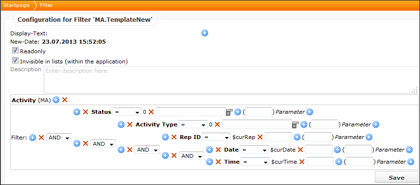
- Assign this filter to a button, e. g. the
AddAppointmentbutton, see Buttons. - Click on
 (Edit) besides Action and enter
your filter's name in the
(Edit) besides Action and enter
your filter's name in the TemplateFilterNamefield.
In this example, when the user clicks on the
 (Add Appointment) button, the filter is applied and the
following data is automatically entered in the new record.
(Add Appointment) button, the filter is applied and the
following data is automatically entered in the new record.
Field values are either used as predefined field values (the field must be included in the record's Edit control or as fixed field values (the fields are configured on the Edit control and, therefore, cannot be changed by the user).
You can also add template filter values to tabs of type CHILDREN by
adding the name of the filter as third argument, e. g.
CHILDREN_MA_MA.MyTemplateFilter.
Creating Child Records for a New Record Automatically
You can also define in Template filters that child records are automatically created for new records.
Example:
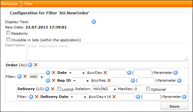
The following filter enters the current date and the current rep in a new order (AU)
record and also creates a delivery date record with the following day of the current
date ($curDay+1d).
If you want to create more than one child record, add the same info area again.
Predefined Values for Additional Child Records
You can also set predefined values for further child records (if more than one child
record are created) that are entered automatically when a user creates a child record by
adding a sub-info area to the Template filter using the WITHOUT
relation.
Example:
The following filter, in addition to the example from, see Creating Child Records for a New Record Automatically also
creates a delivery date record where the delivery date is entered in the WITHOUT
relation ($curDay+4).
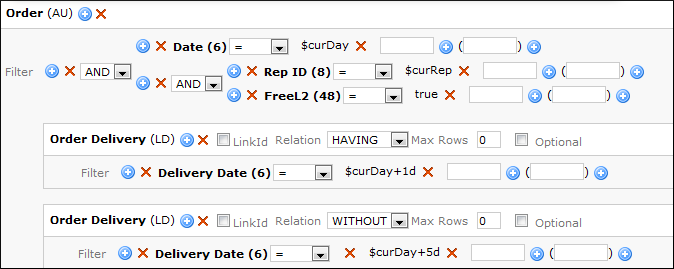
The first record is displayed with date = current date + 1 day, all subsequent child records are created by default with current date + 5 days:
Field Values from a Parent Record
You can copy field values from the parent record to a new child record.
Example: When the user creates a new person for a company, the content of the company's Country field is copied to the person record.
- Define a List control in the field group containing the fields you want to copy.
- Select the desired field in the Fields area and enter the
names for the fields you want to copy in the Function field.

- Enter this field group's name in the
CopySourceFieldGroupNameparameter of the assigned action, e.g. theNewViewaction for theAddPersonbutton. - You can enter the fields with the
$parprefix combined with their function names in the Template filter to access the values from the parent record.
Adding Icons
You can define an area containing icons that execute a function when a user taps on them. For example, if your reps have to cover predefined steps while visiting a client, you can add them to a page.
To configure such icons:
- Define a context menu action.
- Define and/or assign the desired actions for the icons to this context menu. The icons assigned to each menu action are displayed in the application.
- Switch to the desired field group and open the control, where you want to add the icon area.
- Add a tab and enter the context menu action's name into the Type field.
Editing Geographic Coordinates
You can add the geo-coordinate fields (longitude (x) and latitude (y)) to an Edit control and allow the user to clear the stored values and/or set the coordinates to his current location. To do so, perform the following steps:
- Switch to the desired Edit control. For example, Edit control for the FI Field group.
- If necessary, add the Longitude (x) and Latitude (y) fields (the Longitude field must be added first) to the desired Edit view panel.
- Define the following Field Attributes:
For the Longitude (x) field:
- Enable No Label
- Enable Extended Options and enter
{"GPS":"X"}
For the Latitude (y) field:
- Enable Colspan and enter
2 - Enable Extended Options and enter
{"GPS":"Y"}
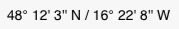
The two coordinates display as shown below, in the Edit view:
When the user taps on the coordinates, the MiniMap displays the location:
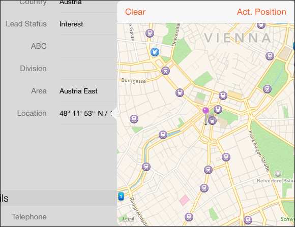
Users can change the geographic coordinates to their current position, delete them (with a long tap on the map), or enter new coordinates manually.
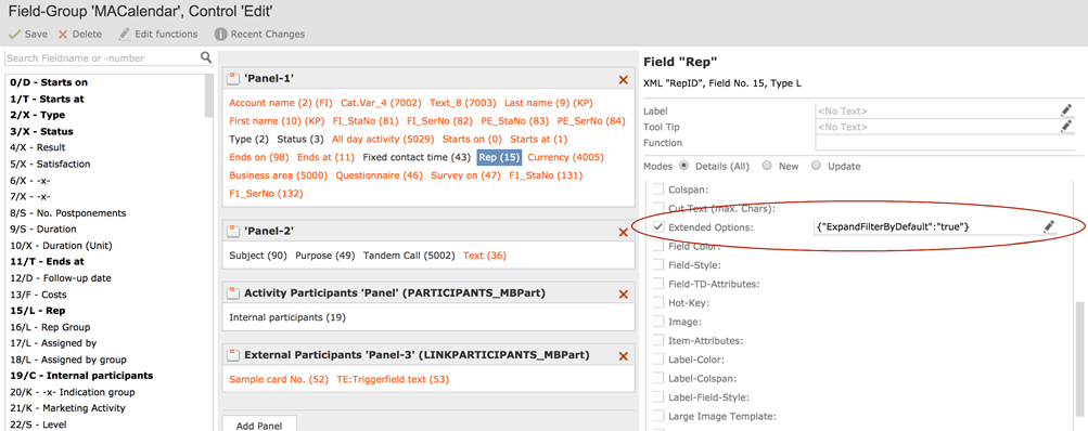
Rep Selection Filter
In some infoareas like Activities you can add Reps as internal participants. The Reps can be presented in groups or as a plain list of all the reps (default view).
{"ExpandFilterByDefault":"true"}