Headers
Learn about the use of header in CRM.pad.
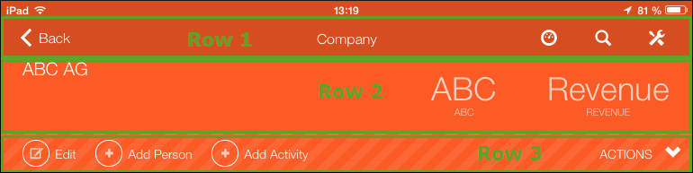
Each page in CRM.pad contains a header that can contain up to three lines displaying the following:
- First row (always displayed): Info area name, navigation button (e.g. Back) and the Home, Search and Control Center button.
- Second row: Tiles (if available).
- Third row: Quick actions and Actions menu.
Two types of headers are available:
- Standard headers providing the standard functions for the user. Standard headings are info area-specific.
- Special headers providing different/additional functions. They can be info area-specific or info area-independent.
Header Group
You can define the contents of the headers displayed in CRM.pad, for example:

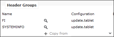
Info area-specific headers are grouped in the Header Groups area of an info area.
If no header group was defined, the corresponding header from the DEFAULT header group
is applied. In the update_tablet configuration, the default header is
the header with the info area ID as name, e. g. FI is the default
header group for the Company info area.
If you add headers for specific functions, use the following naming conventions:
<
infoAreaID
>.<Name>
Examples:
MA.Calendar
AU.SerialEntry
Defining a Header
To define a header group:
- Switch to the desired header group.
- In the Headers for Header Group [info area]
window, click on
 besides the desired view, e. g.
Expand.
besides the desired view, e. g.
Expand.
The header group of the selected header (in this example the Expand header) is displayed.
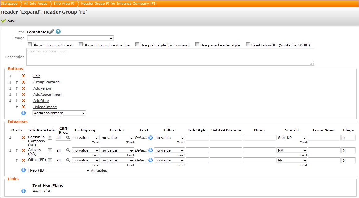
Only the following items are used in CRM.pad
- In the upper area you can define the Text, i.e. the text displayed in the header, whether buttons are displayed with text, what format is used, etc.
- In the lower area, you can define the following:
- Buttons, see Adding Header Buttons.
- Infoareas, see Adding Info Areas (Tabs).
- Links: Not available in CRM.pad
Adding Header Buttons
To define which functions are available in the application add the desired buttons:
- Select a button from the drop-down list (the following example shows the FI
header):
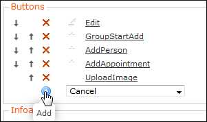
- Click on
 (Add).
 - You can click on a button to change its settings, see Buttons.
- You can change the order using the
 and
and  buttons.
The buttons are displayed in CRM.pad as follows:
Adding Info Areas (Tabs)
You can define that related data is displayed in a separate tab in CRM.pad by adding the desired info area in the header's Infoareas area.
You cannot add a tab for info area-independent headers.
To add an info area (tab):
- Select a button from the drop-down list (the following example shows the FI
header):
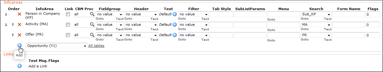
- Click on (Add).
- You can change the order using the and buttons.
The related data is displayed in CRM.pad as follows:
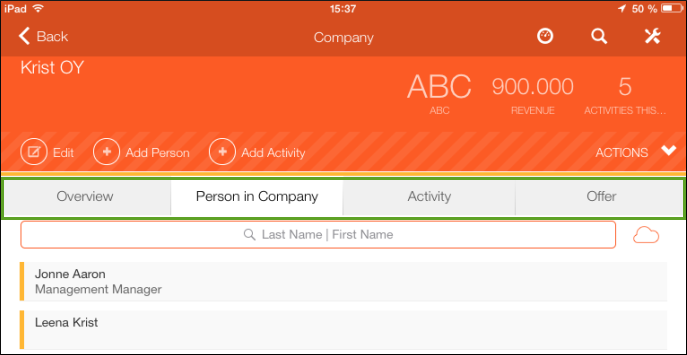
The user can tap on the desired tab to display the data.
Alternative Header Captions
Following texts of the header group referenced in the Expand configuration are displayed in CRM.pad:
- The defined header label (a header's Text field). As a fallback, the info area name is displayed if no header label was defined.
- Edit view: You can define that a different text is displayed in Edit view: Specify the header group holding the desired text in the applied Expand configuration.
Header Tiles
You can define that up to three tiles are displayed in the header.
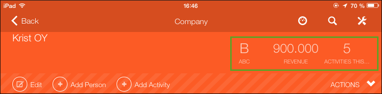
You need to define the following:
- A context menu with the
Tile:prefix in the name, e. g.Tile:Company(included in the default configuration). - Add the context menu actions (max. three) for each tile you want to display. The
names of the context menu actions also must begin with the prefix
Tile:, e.g.Tile:CompanyClassification(assigned to theTile:Companycontext menu in the default configuration)You can only assign the following two actions (all the other
Tiles:<name>included in the default configuration are only used in CRM.mobile).-
Tiles:Record, see Tile:Record. -
Tiles:Search, see Tile:Search.
-
- Add a table caption specifying the fields that are displayed in the tile, e.g. the
Tile:Classificationtable caption (included in the default configuration).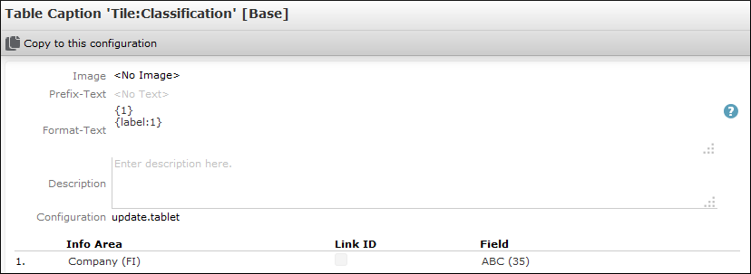
- Assign the context menu as control attribute (see Control Attributes) to the desired
field group, e.g. FI field group:
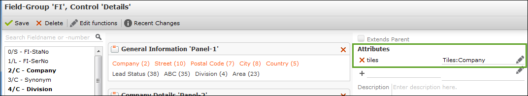
Table
                     Captions
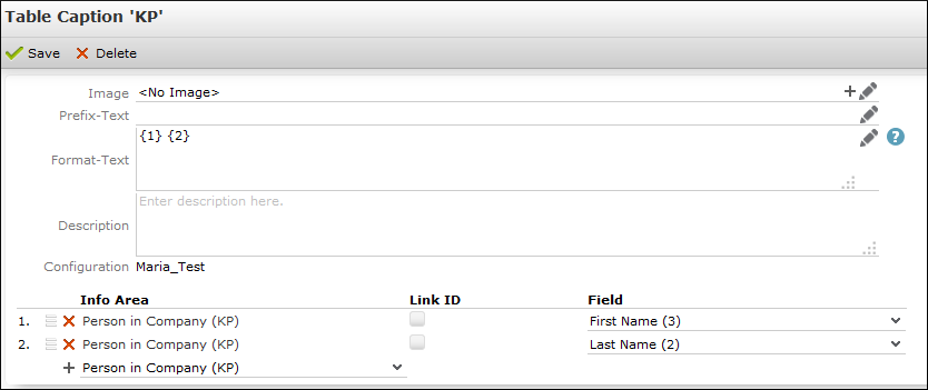
You can define with a table caption which data of a record is displayed in its header, e. g. first and last name for a person or the company name.
To define a table caption:
- You can:
- Switch to the desired info area and click on
Table Captions. - Click on
Table Captions(Views area) on the CRM.designer start page
Example:
- Switch to the desired info area and click on
- You can define the following:
-
Image (optional): Name of an image that is displayed on
the left of the table caption. The image must already be registered, see Images.
- Click on
 (Add) to select a fixed image.
 - Click on
 to define conditions for
an image to be displayed.
to define conditions for
an image to be displayed.
Example:
CAT_AQ_{1}refers to the first field defined under Field. - Click on
-
Format-Text: You can define which fields added under
Field are displayed in which order using
placeholders. For example, in the screenshot above, First Name (1.) and Last
Name (2.) were added.
{1} {2}displays John Doe,{2}, {1}displays Doe, John.If you do not define a Format-Text, no Table caption is displayed.
Note: If you want to display Format-Text without formatting (e.g. display numbers without digit grouping symbol), enter the placeholder as follows{r1} - Description: The given description is only available in CRM.designer.
-
Image (optional): Name of an image that is displayed on
the left of the table caption. The image must already be registered, see Images.
- In the lower area you can add the Fields you want to display
in the table caption. The fields are numbered automatically. Use these numbers in the
placeholders in the Format-Text field, e.g.
{1}{2}etc.