Displaying Record Details
Learn how to configure displaying record details.
How records' details are displayed is defined in the RecordView page. You
can add a RecordView page only to a record's context-specific menu action
in the Context Menus area. The RecordView page is
usually called by the predefined SHOWRECORD menu action that displays the
record clicked in a list with the default Expand Page Configuration.
The Expand configuration defines which field group and header group is used.
To define the Details page:
- Switch to the Context Menu Actions area.
- Select
SHOWRECORDand copy it to your configuration.The menu's configuration is displayed.
- Click on
 (Edit) besides Action.
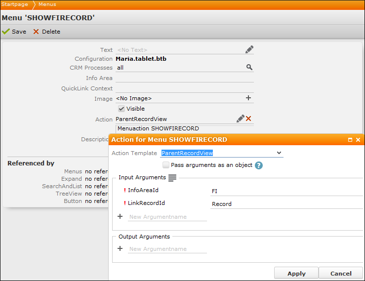
Displaying Data in Additional Tabs
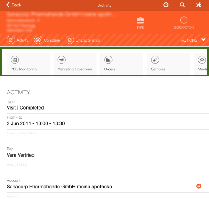
You can define that linked data is available in CRM.pad in additional tabs on the right side of the screen. You can add additional tabs to lists or to Expand views. For example, in Expand view they can contain child info areas, and in lists, as tab could contain the current user's appointments.
To add additional tabs to display data:
- Switch to the header group of the desired info area.
The following example shows the Person (KP) info area:
This Person Details view contains three additional tabs:
- The first tab contains the person's activities (i.e. a search page with a link record).
- The second one contains the person's offers (i.e. a search page with a link record).
- The third one displays the page that was configured in the
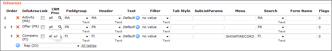
SHOWFIRECORDmenu action. You can add this context menu action on any page. ThisSHOWFIRECORDpage displays a Details view with the context record as link record and a fix target info area.
- You can enable Link if the info area is not linked to the current info area with the default link.
- Enter an existing context menu action in the Menu field to
call the defined action when the tab is displayed.Note: You can add a filter to the tabs. Define a context menu action that calls the desired filter and enter this context menu action's name in the Menu column.
- Enter the text that is displayed on the tab in the Text column
- To change the text of the first tab, add a sub-info area row on top and set
TabStyle to "#" in that row.Note: Fieldgroup and Headergroup are not used. These groups are defined by the Search field.
Switch Tab Index
You can define that a separate tab (sub-list) is opened when the user tabs e.g. on a button.
For example, the Process panel is implemented in the LSI template uses function. In these processes, if a user creates a report by clicking on a button, this report is displayed this in a separate tab ( reports can only be displayed in a separate tab).
To configure this action:
- Assign the
SwitchTabIndexActionaction template to the desired button, see SwitchTabIndexAction. - Define the
TabIndexinput argument. For example, if you enter "2", the tab is displayed as the second tab on the right side.