Widget
Learn about Widget attribute.
Use this attribute to assign another than the default field widget to a specific field.
The following built-in special field input widgets are available:
-
RangeInput:Displays a slider widget for percentage fields.
The slider widget is used for all percentage fields.
To disable the percentage slider for a field, define
widget=TextField.
Define this in the Default control for percentage fields where users are supposed to enter floating point values.
-
PercentField:All predefined percentage fields in the data model are decimal fields and automatically signed. In Aurea CRM.Web they use theRangeInputwidget by default. To support the input of negative percentage values via the slider widget, use thePercentFieldfactory (for those fields where negative values are actually used).
For information on the available options for
PercentField, see the article “HOWTO configure percentage fields” at https://support.aurea.com. -
RatingInput:Graphically displays a row of values. Users can select a value by clicking on an icon. -
CatalogRatingInput:Graphically displays catalog values. Users can select a catalog value by clicking on the respective icon.
-
ValuePickerandFieldValuePicker: Use these widgets to display an image for a field value and allow users to pick another value by clicking on the image.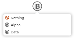
You can implement this for text fields (
ValuePicker) and catalog fields (FieldValuePicker). For a complete description of all available settings, see the article “How to Configure the Field ValuePicker” at https://support.aurea.com.Note: The factories for these widgets are calledArrayPickerFieldfor theValuePickerwidget andCatalogPickerFieldfor theFieldValuePickerwidget. Restriction:ValuePickerandFieldValuePickerwidgets are not supported in List controls. The (textual) field values are displayed as a fallback.
Syntax
Enter one of the following:
- the widget type (i.e. widget's name), e.g.
RangeInput - the name of the widget factory, e.g.
UserWidgetFactory - the widget type plus additional options, e.g.
{type: "UserWidget", options: {text:"City"}} - the factory plus additional options, e.g.
{factory: "UserWidgetFactory", options: {widgetText:"PostalCode"}}
For more details, see the article “How to Configure a different widget for a field” at https://support.aurea.com.
If the widget factory definition contains definitions for specific fields, the widget is automatically used (i.e. in that case you do not need to set the field attribute).
For more information on defining custom widgets, see the articles “How to create a field widget” and “How to Register a field widget” at https://support.aurea.com.
Examples
To configure the CatalogRatingInput widget for the Activity Type field in the MA Details control:
{
	type: "CatalogRatingInput", 	// widget name - mandatory
	options: {
		infoAreaId: "MA",		// info area - mandatory
		fieldId: "Contact",		// field name or id - mandatory
		showValue: true,		// if value text is visible
		imageTemplate: "CAT_CONTACT_BTB_{VALUE}" // image
		}
}
To enter the Service Level of a ticket (KM) using a star rating:

{	type: "CatalogRatingInput", // widget name
	options: {
		infoAreaId: "KM",
		fieldId: "ServiceLevel",
		showValue: true,
		style: "stars" // "plain", "boxes", "stars", "stars-in-boxes"
	}
}
To use the FieldValuePicker widget for the Lead Status field (FI:38):
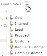
Since the FieldValuePicker and ValuePicker widgets are using the Large Image Template field attribute as a fallback (for their own imageTemplate attribute), you can define the following for FI:38:
Set the Large Image Template field attribute to
CAT_AQ_{VALUE} (already defined in UPDATE_DEFAULT).
Define Widget as
{
factory: "CatalogPickerField"
}
Refer to the SDK page for more sample configurations and information on valid options for all built-in widgets: Inputs > RangeInput, RatingInput, CatalogRatingInput. Since the SDK page already "knows" which widget is used, make sure you only enter the {} expression after options:. The value picker widgets can be found at ValuePicker > ValuePicker, FieldValuePicker.
All field input widgets are also available when defining forms.