Input Widget for Array Fields
Learn to configure array fields defined in the data model.
In Details, List and MiniDetails controls you can configure array fields defined in the
data model to be displayed using a ListInput widget. To access the
widget, go to >> Inputs > ListInput
on the SDK page.
This enables users to quickly enter data using the keyboard to navigate between the fields of the array.
To configure the ListInput widget:
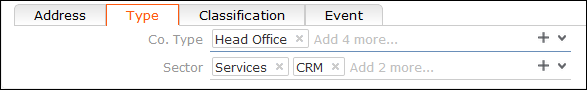
- Add the first field of an array to the desired control (e.g. Co.
Type and Sector in the
FIDetails control).The array is displayed as one field with the label of the first field of the array. Each value is displayed in a small rectangle. A ghost text indicates the number of available fields in the array. In View mode the values are listed separated by comma.
Note: If you add another field or more field of the array, the default field widget is used (drop-down list etc.).
Supported field types: variable catalog, fixed catalog, text, rep input for Participant fields only - see below.
For fixed catalogs the image is displayed as well (if defined). The
Small Image Template field attribute must be defined. For further
details, see Small Image Template.
The Participant fields in the
Activity info area use the ListInput widget by
default. In this case, the number of possible values is not restricted. The separator is
determined by the EMail.Separator Web Configuration parameter. For further
details, see EMail.Separator.