RecordListView
This action template displays records in List view.
Below is a list of input arguments:
|
Input Argument |
Description |
|---|---|
|
Enabled Filter |
Comma-separated list of filters that are enabled by default. Note: Do not enter filters that contain parameters.
|
|
ScanMode |
If set to |
|
SearchPageMode |
Defines the mode that is applied if an alternate Expand configuration (or a configuration that is different from the info area name) exists where the colors for the bar left of a search result item is defined. Possible values:
To combine values, add the values (e. g. |
|
SwipeDetailRecords |
If set to Note: You can also define that the swipe function is globally enabled by
setting the
View.RecordSwipeEnabledDefault Web
configuration parameter, see View.RecordSwipeEnabledDefault. |
|
Sections |
If this argument is empty or set to If set to any other value, list items are grouped based on the list item's first letter. An index is displayed on the left side of the list. If the user taps on the desired letter, records starting with that letter are displayed. |
|
CalendarView |
Obsolete, for compatibility purposes only. Use CalendarView instead. |
|
CalendarPopOverConfiguration |
Obsolete, for compatibility purposes only. Use CalendarView instead. |
|
MaxResults |
Max. number of records displayed in list. |
|
DetailsActionSwitchFilter |
Name of the filter that defines the quick action applied. |
|
MapView |
If set to |
|
ListStyle |
Defines the style how a list is displayed, see ListStyle Input Argument. |
ListStyle Input Argument
ListStyle Input Argument only applies to CRM.pad version
2.x.You can define with the ListStyle argument, how a list is displayed.
The following options are available:
|
Input Argument |
Description |
|---|---|
|
|
Each record is displayed in a row. |
|
|
Each record is displayed in a row. Cannot be changed. |
|
|
Two records are displayed in portrait mode or three records as cards in landscape mode in a row. |
|
|
Two records are displayed in portrait mode or three records as cards in landscape mode in a row. Cannot be changed. |
|
|
Two records are shown as cards in a row. Cannot be changed. |
|
|
Former CRM.pad 1.x list style. Cannot be changed. |
The following only applies if you have the row and card
value is assigned:
- The user can switch from row to card style with a pan gesture.
- In landscape mode only: If no value is specified,
rowis default behavior. The default behaviour can be overwritten by theList.ClassicLayoutWeb Configuration parameter, see List.ClassicLayout.
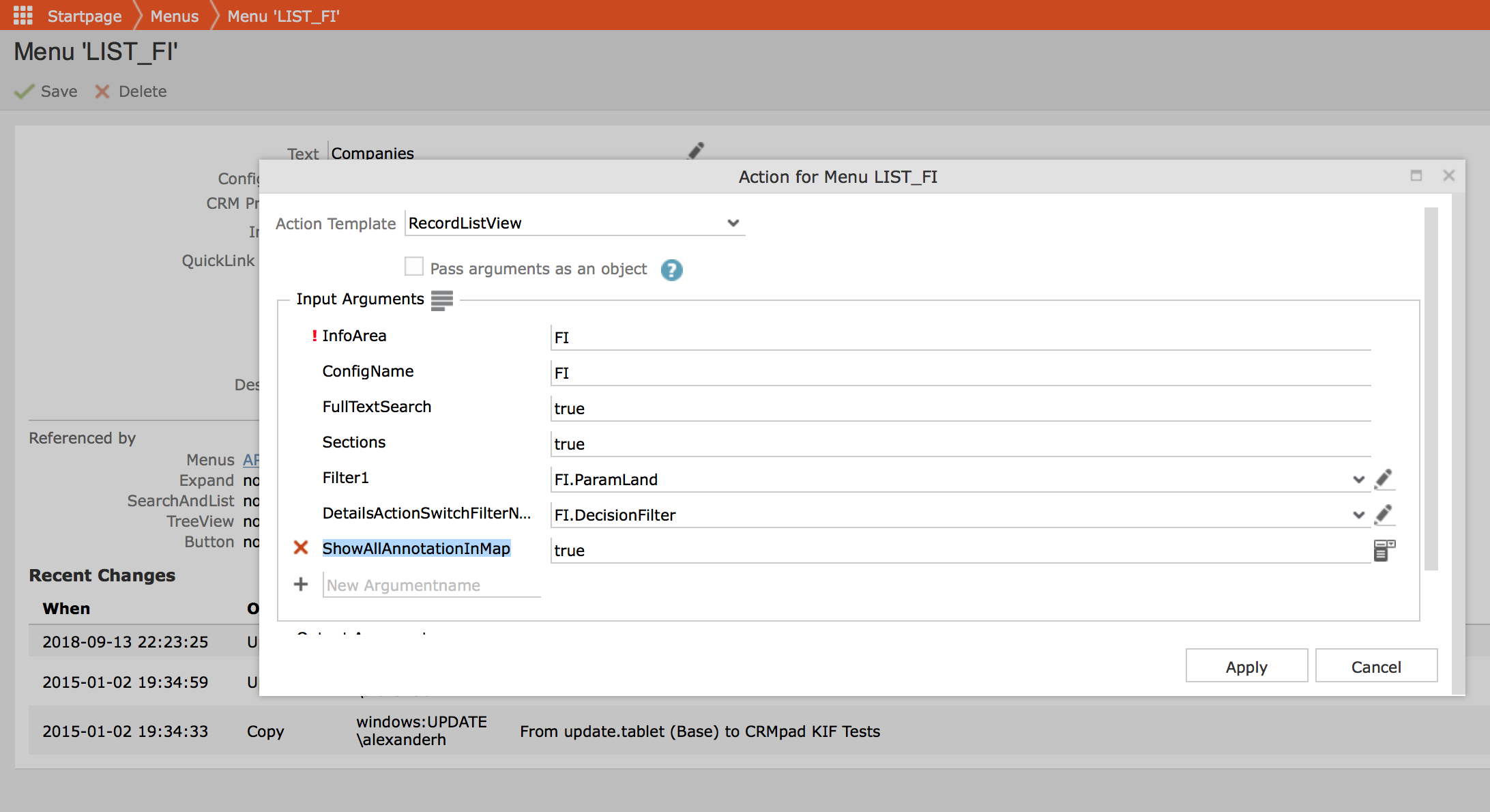
Showing All Annotations in a Map
By default, CRM.Pad does not load all annotations in a Map view. It only displays those items that are viewed in the result list view pane. For example, if a search result list view for a Company infoarea search has 100 Companies in the search result list and the user scrolled and viewed only 40 companies in the search result list, then only those 40 company locations are annotated and displayed in the Map view.
To annotate and display all the items in the result list view, set the option
ShowAllAnnotationInMap to true in the RecordListView action
template. See the screenshot below:
Aurea recommends that you do not display all annotations in a map, if you do not have a set up to provide the latitude and longitude geographic coordinates for the searched items. See, Adding a Map for more details.
Without such a setup, CRM.Pad uses the reverse geocoder to deduce the latitude and longitude based on the address. The geocoder API has a limitation of 50 requests per minute. This is usually not sufficient to load all annotations for the search result items, in a map.