Tab Group Properties
A tab group's properties are defined in the Tab Group Properties window.
Tabs divide the mask into sections. Tab groups consist of several tabs. Users can switch between tabs within a tab group, see Tab Groups.
View Tab
These settings determine the how the tab is displayed:
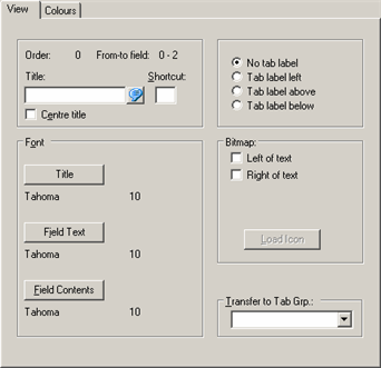
- Order: The order in which the tabs are selected during editing. All tabs in the mask are numbered sequentially (starting from zero), see Editing Tab Groups.
-
From-To Field: The field numbers of the fields in the current
tab. All fields in the mask are numbered sequentially (starting from zero).
Example: Order "4" and From- to field "13-17" indicate that the current tab is number "4" on the mask and there are 5 fields on this tab. If "-1 –1" is displayed, the tab does not contain any fields.
The tab order of the fields is determined by their position within the tab, see Field Tab Order.
- Title: The name of the tab. If the tab is a member of a tab group, this text is displayed on the tab's label. Add the "&" character before the letter entered in the Shortcut field to underline the letter used to switch to the tab.
- Shortcut: Enter a letter to be used as a shortcut. Alt+Letter switches to the tab.
- Center title: Centers the title.
- No tab label: The tab group is displayed without a label.
- Tab label left/above/below: Determines where the label is displayed.
Font
- Title: The font type, size etc. used for the title.
- Field Text: The font type, size etc. used for field names.
- Field Contents: The font type, size etc. used for field contents.
Bitmap
- Left/Right of text: Determines whether the selected icon is displayed to the left or right of the tab title.
- Load Icon: Click on this button to select an icon. You can only select Aurea CRM bitmaps. You need to select either Left of text or Right of text check box before you can click on this button.
Transfer to Tab Grp.
Use this option to select assign the tab to a tab group, see Editing Tab Groups.
Colors Tab
These settings determine the colors, backgrounds and borders used by the tab:

Output
- Double border: Surrounds the tab with a double border.
- No border: The tab is displayed without a border.
- Fixed border: If this option is enabled, the double border remains unchanged when a field in the tab receives focus (in edit mode). This option only applies to the Double border option. This option has no effect on tabs with a label.
-
Transparent: The tab is displayed transparently, but field
colors are retained.Note: The Transparent option is not suited to tab groups.
- No background: The background color of the tab is disabled. The current mask color is used instead.
- Always visible: The tab remains visible, even if it contains no visible fields. You can use this option to display the tab even if the user does not have the appropriate field access rights.
-
No field border: All fields in the tab are displayed
without a border.Note: The No border setting for individual fields takes precedence over this setting.
- Gradient: The tab color is displayed with a gradient. The Tab Background and 2nd background color colors are the 2 colors used.
- Use default colors: Enable this option to ignore the current settings and to use the color settings defined in the current desktop format instead, see Colors Tab and Skins Tab.
Colors
To determine the colors of elements in the tab:
- Select the corresponding element from the list.
- Select the desired color from the drop-down list.
A preview is displayed to the right.
Background Pattern
Select the background to be used by the tab here.
Double Border (Field)
Use these settings to determine which fields are displayed with a double border. Double borders are only displayed in edit mode for mandatory, catalog and text fields.
Color Tables
Click on this button to select from a number of predefined color schemes. A preview of the selected settings is displayed.
Click on Tabs to assign the selected color scheme to several blocks. Blocks with no title are listed using the tab number (displayed under Order on the View tab), see View Tab.