Button Properties
A button's properties are defined in the Button Properties window.
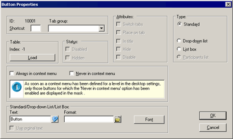
Fields of Button Properties window:
- ID: The button's ID is assigned automatically by the system.
- Tab group: Assign the button to a tab using the drop-down list. To use the button to switch between tabs, enable the Switch tabs option under Attributes as well.
- Shortcut: Enter a letter to be used as a shortcut. Use Alt+Letter as a shortcut instead of clicking on the button.
Table
- Index: ID of a predefined Aurea CRM button loaded using the Load button (-1 for user-defined buttons).
-
Load: Loads a pre-defined Aurea CRM button.
Different buttons are available depending on the context, e.g. ">> Extended Search" and "<< Simple Search" (numbers 1265 and 1266) are available in the company search mask. Other buttons are available in all masks, e.g. "Add to Favorites" (number 1275).
Use the Format field under Standard/Drop-down list/List Box to assign triggers, workflows, reports etc. to a user-defined button, see User-defined Buttons.
Status
- Disabled: Automatically enabled for buttons used to switch between tabs and cannot be changed.
- Hidden: Automatically enabled for buttons used to switch between tabs and cannot be changed.
Attributes
Switch tabs: Enable this option to use the button to switch between tabs, >> .
- Place on tab: Places the button on the tab. The button can then only be moved within the tab.
- In title: Positions the button in the tab's title.
Hide: The button is not displayed when the corresponding tab is active. To make a button visible again, select Options > Show all Elements, double-click on the name of the button, and disable the option.
- Disable: The button is displayed as inactive when the appropriate tab is active. This option does not need to be enabled for buttons used to switch between tabs; these buttons are displayed as inactive by default when the appropriate tab is active.
Type
- Standard: Standard button.
-
Drop-down list: The button is displayed as a drop-down
list.
The following drop-down lists are predefined:
- For choosing a category in the mask in the Document info area (no. 1030)
- For choosing the month and year in the Calendar (nos. 1015 and 1016)
- BTB only: for choosing a rep in the Opportunity Overviewinfo area (no. 4066)
You can also use drop-down lists to directly choose selections in the Properties (BTB) and Company+Person levels, see Selections in the User Manual. Choose the button "1237 Selection" using the Load button under Table.
-
List box: The button is displayed as a list box.
The following list boxes are pre-defined:
- Define Print Format (no. 1033)
-
Participants list: This option is only available in the
Activity level and is used to display participants (no.
1082).
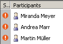
Use the Load button to load the Participants button.
Always/Never in context menu
You can determine whether buttons are displayed as mask buttons or context menu entries:
- Always in context menu: The button is displayed as a context menu entry.
- Never in context menu: The button is displayed as a button in the mask.
Standard/Drop-down List/List Box
-
Text: Name of the button, drop-down list or list. Add the
"&" character before the letter entered in the Shortcut
field to underline the letter.
Format: Format(s) executed by clicking on the button, see User-defined Buttons:
- Font: Use this button to specify the font settings for the button's text.
- Use original Text: This check box is available if you have loaded an Aurea CRM button using the Loadbutton. Enable this check box to display the original button text in all languages.