Running the Analysis
Learn how to run an analysis.
To run the analysis:
- Select File > Analysis from the menu. Select the transfer
format you defined earlier under Analysis format.
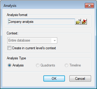
If you did not previously specify a context or analysis type, you can select one now.
- Click OK.
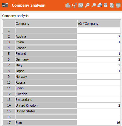
The number of companies per country is displayed.
- Use the context menu or buttons in the header to switch between the various display options:
- Table: Hides and displays the table.
- Show details: Displays all entries for the selected row.
-
Bar Chart (
 ) / Pie Chart (
 )Displays the results
as a bar or pie chart.
)Displays the results
as a bar or pie chart. - < X (inactive), X > (inactive): These options are needed for more complex analyses, see Complex Analyses.
-
Percent (
 ): Displays the results as percentages of the total.
 - Show execution schedule: Displays how data is read.
- Click on a bar (or segment) to display a table containing the associated data
(drill-through). The fields defined in the transfer field format are displayed in the
table.
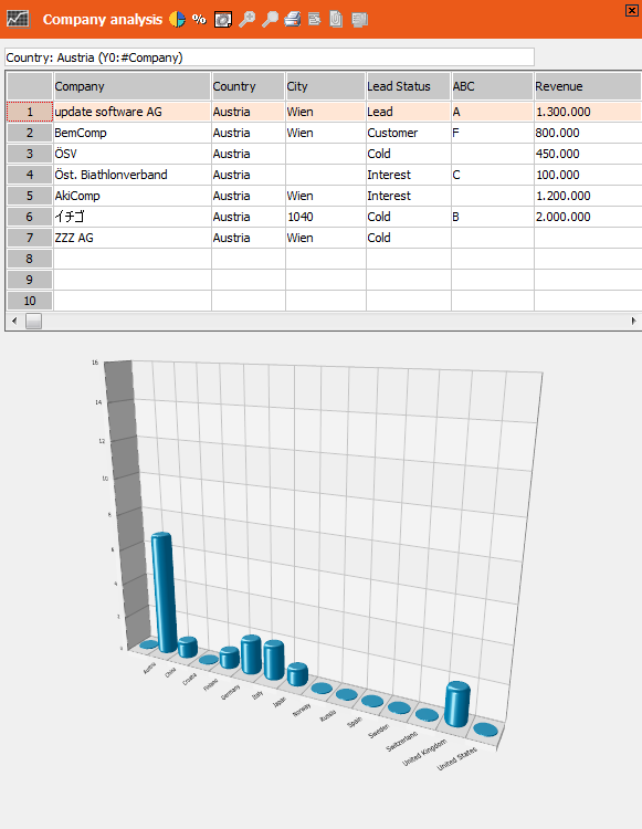
Click in the (empty) upper left cell to close the table.
- Click
 (Settings) to configure the analysis, see Options.
 - Double-click on a company in the table to open and edit the company in
the Company+Person level. The analysis remains open in the
background. Click
 (Back) in the icon bar to return to the analysis.
 - Click
 (Excel) to transfer the data to Microsoft Excel. If you are
displaying the details of one of the bars, only that data is transferred.
(Excel) to transfer the data to Microsoft Excel. If you are
displaying the details of one of the bars, only that data is transferred.
Options
The options available depend on whether you are displaying a bar chart or pie chart:
Sort
These options are used to determine how the data in the charts are sorted.
- Ascending / Descending: Data in the chart is sorted in ascending or descending order.
- Alphabetical: Data is sorted alphabetically.
- Fixed: Data is sorted according to the order of the lines in the analysis unit format.
Display decimal places
Determines whether decimal places are displayed.
Alignment Legend/Levels (only pie charts)
- Left/Right: Displays the legend to the left or right.
- Top/Bottom: Displays the legend at the top or bottom (only for charts using the ComponentArt graphics).
- Show legend: Displays the legend.
- Sum total in legend: Sum totals are displayed in the legend next to the analysis unit (only for charts using Aurea's graphics).
- Display labels on pie charts: Labels are additionally displayed on the chart (only for charts using the ComponentArt graphics).
Text/Caption (only pie charts using Aurea's graphics)
- Border: Displays text with a border.
- Background: Displays text with a different background color from the chart.
Bar (only bar charts)
- Scale on the side: Displays the scale on the left of the chart (only for charts using Aurea's graphics).
- Scale on background: The unit of analysis can be shown in the background in addition to or as an alternative to showing the unit of analysis at the side (only for charts using Aurea's graphics).
- Maximum bar height: The highest bar value is used to limit the size of the bar chart.
- Relative bar height: The cumulative total across all columns is used to limit the size of the bar chart.
- Visible bars: Determines the maximum number of bars displayed at once (only for charts using Aurea's graphics).
- Show totals: Displays sum totals at the bottom of the chart (only for charts using Aurea's graphics).
- Split levels: Levels (several bars behind one another) are split into separate charts (only for charts using Aurea's graphics).
Settings (only bar charts using Aurea's graphics)
Click on the Levels, Classes and Totals buttons to define the colors and font used in the following parts of the table (1=Levels, 2=Classes, 3=Totals):
Determine the color of the Background, Text, Top frame, Bottom frame as well as the Font settings.