Grouping Buttons
Learn to group buttons to avoid clutter on the user interface.
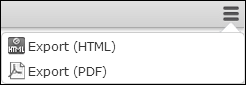
You can group several buttons configured in a header to achieve a less cluttered user interface without removing functionality. Example: The various report buttons are grouped in the default SearchResults header in UPDATE_DEFAULT.
Group Start/End
You can create a group of buttons using the invisible Group Start and
Group End buttons: All buttons in between are part of the group. The first
button is displayed by default.
Use Group Start (with Text) to the display the button text of the first
button or Group Start (without Text) to hide it. The texts of the buttons in
the drop-down list are always displayed.
Users can select the other buttons from a drop-down list. The user's choice is stored, making the last used button visible by default.
To disable this behavior, create the Web Configuration parameter
Header.KeepGroupTopElement (type: Character). For further details,
see Header.KeepGroupTopElement. Set
it to "true" or "1" to disable the storing of the last selection: The first button of the
group is then always displayed on top.
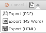
Group Start
        (Menu)
Alternatively you can use the Group Start (Menu) button to create a button
group. This displays a context menu button  . All buttons configured below the
 Group Start
(Menu) button are part of that context menu.