Header Attributes
Learn how to configure header attribute.
For each header you can define:
-
Text: The text displayed in the header, e.g.
{INFOAREAIMAGE} Search {INFOS}. Enclose placeholders in {}.
Use the following placeholders: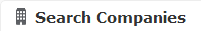
-
{RECORD}: The current record's table caption, see Table Captions. Use{RECORD:<Table Caption Name>}to specify another than the default table caption. -
{RECORDLINK}: Like{RECORD}, but as a link to that record. Clicking the link executes the info area's default action. -
{RECORD[param]}: The table caption of the record whose uid is passed asparam. -
{RECORDLINK[param]}: A link to the record whose uid is passed asparam. -
{NORECORD:text}: A text (or text ID) to be displayed in the header. Use{NORECORD:text}together with{RECORD}in process headers. -
{IMAGE:imagename}: An image with the specified name. The image must be registered in CRM.Designer, see Images -
{INFOAREAIMAGE}: Displays the info area's default image. The image must be registered in CRM.Designer asINFOAREA_<InfoAreaId>.Use
{INFOAREAIMAGE[:size]}to specify the size: "n" for 24x24 px or "s" for 16x16 px. -
{INFO}: The name of the current info area. -
{INFOs}: The plural name of the current info area as defined on the Info Area Labels page, see Info Area Labels. -
{<InfoAreaId>}: The name of an info area. -
{<InfoAreaId>s}: The plural name of an info area as defined on the Info Area Labels page. -
{SUBINFOS}: A drop-down list with configured sub-info areas, see Related Data area (Header Info Areas). -
{LINKS}: The configured links displaying related data, see ExpandOptions.
-
-
Image: The name of the image displayed left of the header text.
The image must be registered in CRM.Designer, see Images.Note: Headers support only one image: The image defined in Image overrides the image defined in Text. If no Image is defined and the Text contains the table caption of a record (
{RECORD}): If the table caption contains an image definition, this image is displayed. - Show buttons with text: If checked, buttons are displayed with their defined label text, otherwise only the button image is displayed, see Header Buttons.
- Show buttons in extra line: If checked, buttons are displayed in a separate line, i.e. below the header text.
-
Use plain style (no borders): The header is displayed without the
bottom line.

-
Use page header style: Uses a style without background color.

This style is automatically applied, if a header actually is the header of a page, e.g. a
Searchheader. - Fixed tab width (SublistTabWidth): currently no function