Configuring a Button
Learn to configure a button.
To configure a button:
- Select a button or create a new one. For further details, see Designing Configuration Units.
The following settings are available: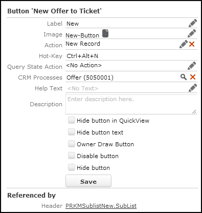
- Label: The button's name either displayed as a tool-tip or as text on the button, depending on the header configuration. For further details, see Header Attributes (Buttons with Text option).
- Image: The button’s icon. The image must be registered in CRM.Designer. For further details, see Images.
-
Action: Define the action to be executed by clicking the button.
- Select Menu Action to call an already defined menu action. For further details, see Menu Actions.
- Select Action Template to define a new action based on an action template. For further details, see Defining an Action.
Note: To show or hide buttons depending on the user's access rights, you need to specify a menu action that is configured accordingly. For further details, see Menu Actions (Info Area option). -
Hot-Key: the hotkey or keyboard shortcut for activating the
button.
You need to manually enter the hotkey definition in the Hot-Key textbox, since just pressing the respective key combination has no effect. Use the following syntax:
-
Ctrl/Alt/Shiftas modifiers -
F2toF12for function keys - combine the individual elements with "+"
Examples:
Shift+Alt+G,Ctrl+S,F7, Shift+F6,Ctrl+#49
The following hotkeys are not supported:
-
F1and any combination withF1(Ctrl+F1,Alt+F1,Shift+F1) -
Alt+F4Function keys with browser-specific functions (e. g.
F3,F5etc.) should not be used as well.
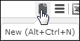
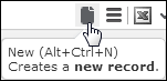
The defined keyboard shortcut is displayed in the button's tooltip.
 Note: For buttons in groups no tooltip is displayed. For further details, see Grouping Buttons.
 -
-
Query State Action: Determines under which conditions the
button is active. Specify a menu action containing an appropriate JavaScript
function to flexibly control whether the button is enabled or disabled. If the
JavaScript function returns
falsethe button is enabled, if it returnstruethe button is disabled (grayed out).Alternatively, an object in form
{disabled:<true|false>,
                        done:<true|false>}
can be returned, where thedisabled-property is interpreted as before and thedone-property signalizes whether the periodic re-querying of the state should be stopped.UPDATE_DEFAULT contains the following standard JavaScript functions to be used with Query State Action:
-
C_OneRowSelected:the button is enabled if exactly one row is selected. -
C_OneRowSelectedOrNoList:the button is enabled if exactly one row is selected or if used in anExpandorTreeheader. -
C_NoRowSelected:the button is enabled if no row is selected. -
C_RowsSelected:the button is enabled if one or more rows are selected -
Check_VirtualInfoArea: the button is disabled if used in the header of a virtual info area (example in UPDATE_DEFAULT:DefaultValuesDefinebutton.
In addition, you can use the
QueryStateBindingaction template to enable/disable buttons using bindings. Examples in UPDATE_DEFAULT:-
C_SocialInbox_CanAssignPerson(used to enable/disable theSE_AssignPersonbutton) -
C_SocialInbox_CanRespond(used for theSE_RespondandSE_Invitebuttons)
-
- CRM Processes: Assign one or more CRM processes to the button. For further details, see Roles & CRM Processes.
-
Help Text: Add a description of the button's purpose. The
Help Text is displayed in the button's tooltip (in a new
line).
The default text group for button tooltips is
ButtonHelp.You can use the Markdown syntax to format your help text. for further details on Markdown syntax, see http://en.wikipedia.org/wiki/Markdown.
- Description: Add an internal description (only visible in CRM.Designer).
- Hide button in QuickView: If checked, the button is hidden from the QuickView. For further details, see QuickView.
- Hide button text: The button is displayed without its label, i.e. only the icon is visible. A tooltip with the button text is displayed on mouse-over.
- Owner Draw Button: Do not modify! This option is checked for buttons that are displayed as drop-down lists in specific headers (e.g. the rep/filter set drop-down lists in the Calendar sidebar). This option is for internal use only: Do not change this setting.
- Disable button: If checked, the button is displayed inactive (grayed out).
- Hide button: If checked, the button is not visible for the users even if it is configured e.g. in a header. The next button to the right moves up and takes the place of the hidden button (thus avoiding a gap).
- Click Save.
For information on how to configure toggle buttons, see the article “How to toggle buttons in a header” at https://support.aurea.com.
Toggle button examples in UPDATE_DEFAULT: Toggles(M_CalendarViews), Toggles(M_AnalysisResultViews) and Toggles(M_MarketingCalendarInfoAreas).