Context menu or header
This tab allows you to make settings that apply to the context menu and to the level header.
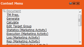
For further details, see Context Menu and Level Header.
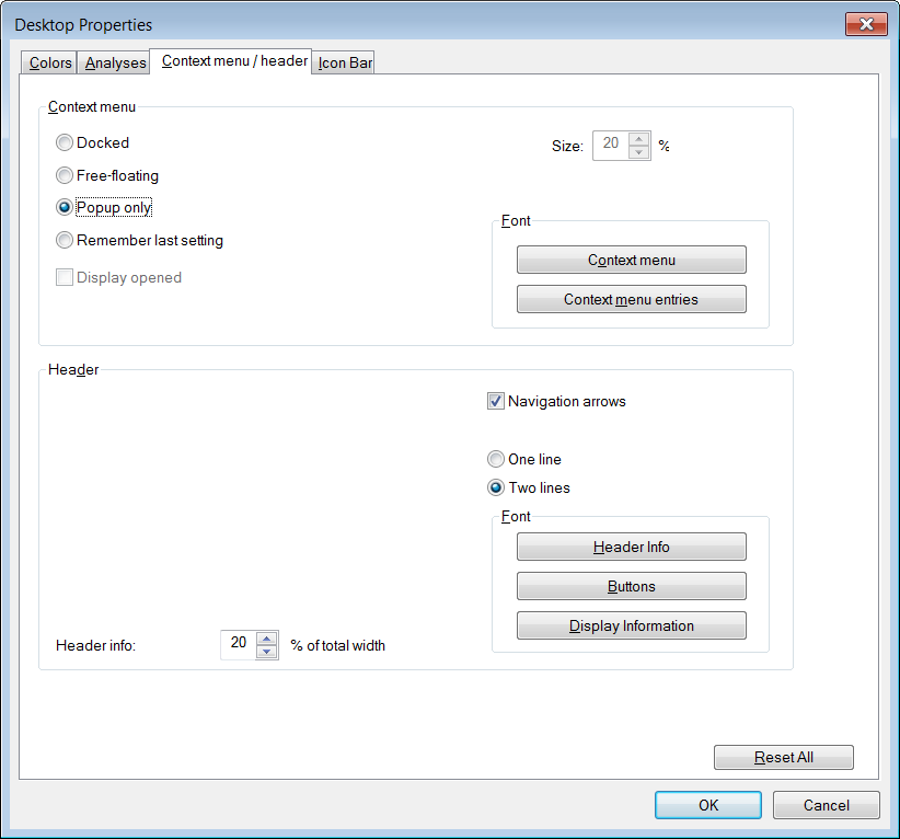
The following options are available:
Context Menu (pane)
- Docked: Select this radio button if you wish the context menu to dock on the right hand side of the mask when Aurea.CRM win is started.
The context menu can be positioned freely by dragging it to the desired position. If you switch to another info area, and then return to the previous level, the context menu continues to be displayed at its last position.
Free-floating: Select this radio button if you wish the context menu to appear at the top left of the mask (beneath the level header) when Aurea.CRM win is started.
The context menu can be positioned freely by dragging it to the desired position. If you switch to another info area, and then return to the previous level, the context menu continues to be displayed at its last position.
- Popup only: Select this radio button if you only wish to access the context menu using the right mouse button within the mask, or using the Context Menu button in the command bar.
Even if you have chosen a different option than Popup Only you can still access the popup menu by right-clicking on either the mask or list.
- Remember last setting: Enable this radio button if you wish the context menu to be displayed in the same position it is in when Aurea.CRM win is last closed.
- Display opened: Enable this check box if you wish the context menu to be open when Aurea.CRM win starts.
- Size: Size of the context menu. The maximum value is 40% of the size of the level's window.
- Font: Click on the Context menu button to set the font, style, size, color etc of the context menu's header. Click on the Context menu entries button to set the font, style, size, color etc. of the context menu's entries.
Header (pane)
- Header info: You can define what percentage of the entire width of the level header is taken up by the level header info. Should the text be longer than the defined width, the excess text is cut off, and replaced with "..." instead.
- Navigation arrows: Enable this check box to display the navigation arrows in the function bar. You may not require these buttons, as you can navigate using the keyboard. However, they are always displayed in the summary index card.
- One line: The level header info is displayed in a single line.
- Two lines: The level header info is displayed over two lines.
- Font: You can determine the font, size, color, etc. of the level header info, command bar and view mode bar from here.