Property Grid
The Property Grid lists all supported parameters for the selected element.
The meaning and possible values of each parameter is described in the tooltip. For CRM-specific widgets you can also refer to the Aurea CRM.Web SDK Client Reference located at https://support.aurea.com/sdk/reference/ and to the corresponding action templates and their input arguments. For further details, see Action Templates.
For text fields of the Property Grid you can click  (Select text) and
access the multilingual CRM.Designer texts (e.g. for labels). For further details,
see Texts. In the Property Grid
CRM.Designer texts are displayed as
(Select text) and
access the multilingual CRM.Designer texts (e.g. for labels). For further details,
see Texts. In the Property Grid
CRM.Designer texts are displayed as
{TXT_<textgroup>_<number>}. The Preview displays the text in
the default language. You can combine CRM.Designer texts and plain text. Example - to add
punctuation: {TXT_<textgroup>_<number>}
:
{TXT_<textgroup>_<number>}.
For each parameter the context menu offers options to reset the value (Reset to default, Set to <null>).
 resets any default values inside the group to undefined. If you want to undo your changes, make sure you select Reset to default (from the context menu) for the properties group. Otherwise the widget may no longer work.
Click Apply to see your changes in the Preview pane. The settings of the DOM Element tab are immediately applied to the Preview as well.
Widget tab
|
The Widget tab contains all supported parameters controlling the behavior of the widget. Mandatory parameters are highlighted and tagged with *. For each parameter the default value is displayed. Use the context menu option Set from binding to enable data binding. For further details, see Data Binding. |
|

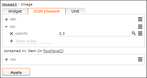
DOM Element tab
|
The DOM Element tab contains options to change the visualization of the widget. You can define:
All available DOM Elements are supported. |
|
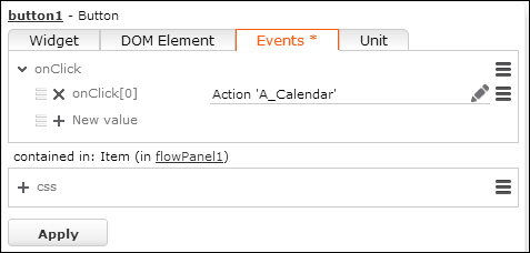
Events tab
|
Use the Events tab to define actions for
predefined events. The list of predefined events is fixed for each widget
and cannot be changed (i.e. for the To define an action:
|
|
 (
( (
(
Unit tab
Use the Unit tab to assign a CRM process to each widget. For further details, see Assigning CRM Processes.