Form Designer
An overview of form designer.
To get started designing forms using the Form Designer, read HOWTO Use the Form Designer to get a quick overview in terms of structure, handling, features and other interesting information.
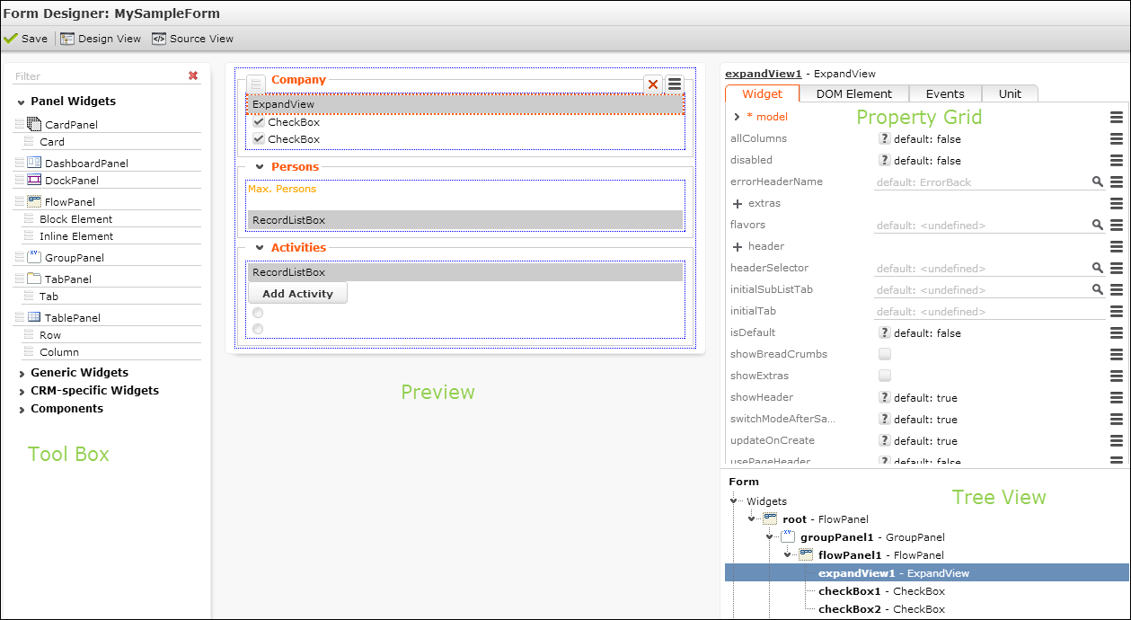
The Form Designer consists of the following areas:
- Tool Box: Lists all available widgets and components. For further details, see Tool Box. Enter a filter string in the field above the list to search for an element.
- Preview: Displays the current form. Use drag&drop to add elements to the form. For further details, see Arranging Elements on a Form.
- Property Grid: Lists all supported settings for the selected element. For further details, see Property Grid.
- Tree View: Displays the elements of the current form hierarchically. Select an element in the Tree View to edit it's properties.
You can resize the areas of the Form Designer by dragging the border with the mouse.
For each element in the Tool Box and the Property Grid you can display an explanatory tooltip on mouse-over. The tooltip also contains links to the respective page in the Aurea CRM.Web SDK Client Reference located at https://support.aurea.com/sdk/reference/. In addition, miscellaneous hints and examples can be found here. For further details, see Hints.
In the code, elements are referenced by the name - "Button". The elements you add to your form are named automatically as "Button 1", "Button 2", ….…."Button x".
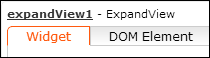
The name of the currently selected element is displayed as a link above the Property Grid. Click on the link to change the name.
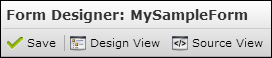
Use the Source View/Design View buttons to toggle between code and WYSIWYG view.