Button
You can define possible answers as buttons.
Users choose an answer by clicking on a button.
Specify the following:
-
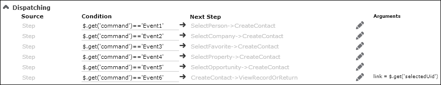
Event No.: The number of the event to be fired if the user clicks
the button. The actual events are defined in the Dispatching area
of the step definition, see Dispatching.
- DisplayText: The button's label.
-
Parameters (optional): The following parameters are available:
-
image:You can specify an image to be displayed and its minimum size, e.g.:{image: "MyImage", minWidth: "120px"}.The image must be registered in CRM.Designer, see Images.
-
tooltip:You can specify a tooltip for the button:{tooltip: "This is a help text."}Or you can reference a (multi-language) CRM.Designer text:
{tooltip: "TXT_<textgroup>_<number>"}The default text group for button tooltips is
ButtonHelp.You can use the Markdown syntax to format your help text, see http://en.wikipedia.org/wiki/Markdown.
-