| To select a different MailStream |
Click the MailStream drop-down list and then select the MailStream you want. The list contains all the MailStreams you have permission to view
|
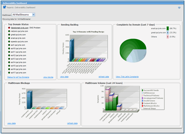
| To view statistics for an indicator in one of the graphs |
Move the pointer over the indicator. For example, in a bar chart, move the pointer over a bar
|
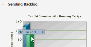
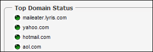
| Top Domain Status |
Displays the top 14 domains based on a nightly calculation of list membership. The color of the oval to the left of a domain name indicates a particular status:
- Red: All IPs completely blocked
- Orange: At least 51% of IPs are blocked
- Yellow: Up to 50% of IPs are blocked
- Green: No blocks on any IPs
|
| To view a list of all top domains within the list/site/server |
Click Status for All Top Domains
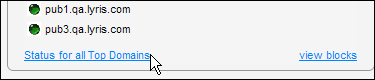
On the page that appears, you can view the status, % blocked, domain, number of members, and a description of the block
|
| To view MailStream blocks |
Click view blocks. On the page that appears, you view the name of the MailStream blocked, IP address blocked, the domain blocking it, Blocking MX, a description of the block, the SMTP response code Aurea List Manager received, the duration of the block, the mailing and member responsible for the block, and the next retry
|
| To return to the Deliverability Dashboard |
Click the back button in your browser
|
| Sending Backlog |
This shows you a bar graph of the top fourteen domains with pending recipients
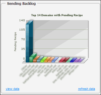
To view a list of specific totals for the domains, click View data. To update the data, click Refresh data
|
| Complaints by Domain |
This displays a pie chart with the complaints for each domain broken down by percentages
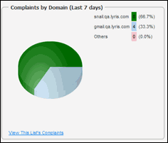
To view a list containing the title and description of each complaint, click View This List's Complaints
|
| MailStream Blockage |
Note
In Aurea List Manager 10.2b and later, this section is called Mailstream Queue
This shows you a bar graph of all MailStreams and the amount of blockage they have. In the image below, the Default MailStream is the only one with blockage.
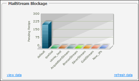
To view a list containing each MailStream and its blockage amount, click View data. To update the data, click Refresh data.
|
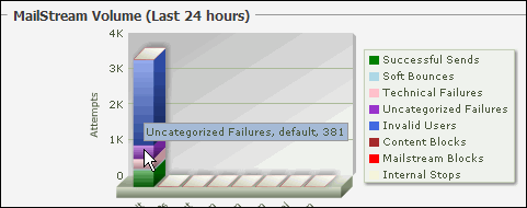
| MailStream Volume |
This shows you the status of email sent within the last 24 hours. A single bar indicates all email for a particular MailStream. There are eight different categories ; the color coding in the bar graph indicates which category the email falls into. For example, in the image below, most of the email for the MailStream Default has been categorized as Invalid Users, as indicated by the blue portion of the bar
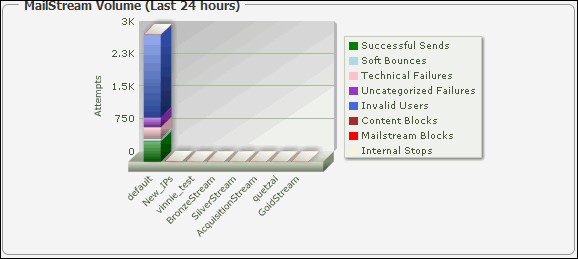
To view statistics for an individual category, move the pointer over a colored section in the bar
|