Configuring Dashboards
To configure a dashboard:
- Add the
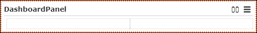
DashboardPanelwidget as root widget to your form. (TheDashboardPanelwidget can be added to any kind of panel widget as well.)By default, a two-column grid containing placeholders is created. Use the layout attribute to set/change this default (1Column | 2Columns | Tab).
The
DashboardPanelwidget uses the special headerDashboardPanelcontaining the buttons for switching between views, hiding items and resetting the dashboard.To configure an additional custom header (e.g. a personalized text like "Welcome {identity:repName}!" on a start page), define a special header and enter it as
HeaderNamein theShowFormaction. For further details, see ShowForm and Placeholders in Texts. - Enter a
settingsName: This name is used as storage key for the user customizations rearrange panels, selected view etc. - Add the desired items to the grid. For further details, see Arranging Elements on a Form. You can use
any kind of widget: CRM widgets, panel widgets, generic widgets like buttons etc.
Each item is created inside a
DashboardPanelItem, i.e. a specific area of the dashboard. Use panel widgets to add multiple items to oneDashboardPanelItem.- To reorder items, select the widget contained in the
DashboardPanelItemand use the (Drag&Drop) button.
 - To hide items that contain no data (e.g. due to rights restrictions or an
assigned CRM process), set the
hideItemsIfEmptyproperty totrue.Note: Hiding empty items may impact performance because it requires pre-loading all widgets.
- To reorder items, select the widget contained in the
- To edit the
DashboardPanelItem's settings, select one of it's items.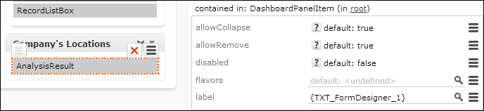
- Define a label to be displayed as the caption of the respective area of the dashboard.