Responsive behaviour of CRM.Client Application
CRM.Client application user interface is designed to provide an optimal user experience for different screen sizes, layouts, and resolutions.
When you change the screen size, CRM.Client responds appropriately by resizing the different screens and panels dynamically to provide an optimal experience using the application.
The following topics describe the dynamic responses rendered by the application for different screen resolutions.
Screen Resolution and Orientation
Windows 10 Desktop and Mobile devices
- On Windows Mobiles and Tablets, CRM.Client application requires a minimum screen resolution of 320 x 500 pixels. If either of the resolutions, width or height is less than the minimum value provided the CRM.Client application does not start.
- On Windows Desktop, when the width or height of the screen is greater than the minimum prescribed then the screen size is adjustable till the minimum values are reached.
Apple iOS Devices
The following screen resolution configurations apply for different device types:
- Apple devices running iOS versions greater than 9 are supported.
- iPhone 5 is the minimum supported mobile device.Note:
- iPhone X is not supported.
- iPhone only supports Portrait mode.
- iPad supports both portrait and landscape mode with a minimum screen resolution of 768 x 1024 points. Example devices: iPadMini and iPad Air 2.
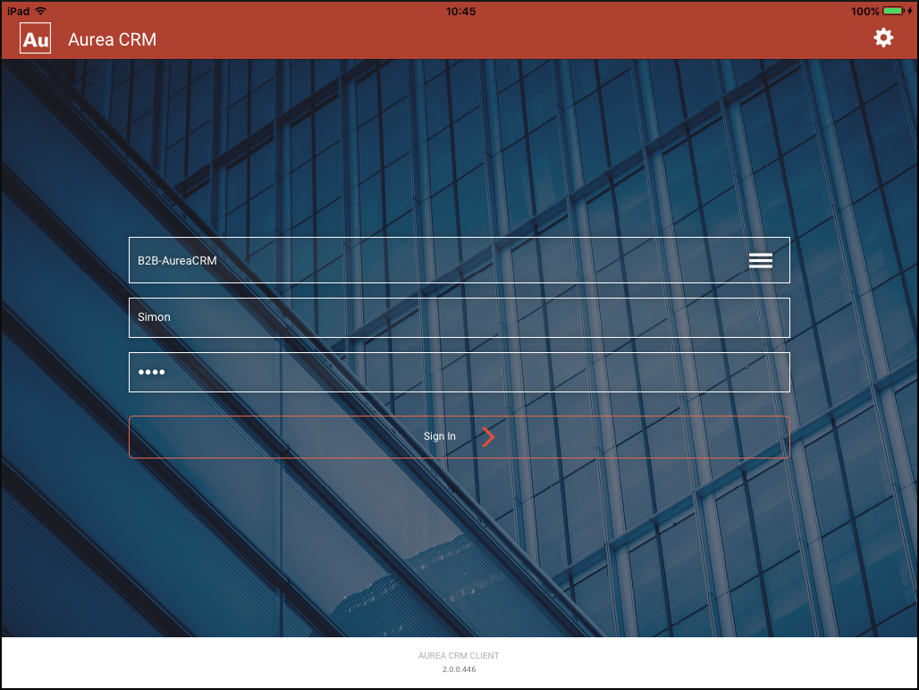
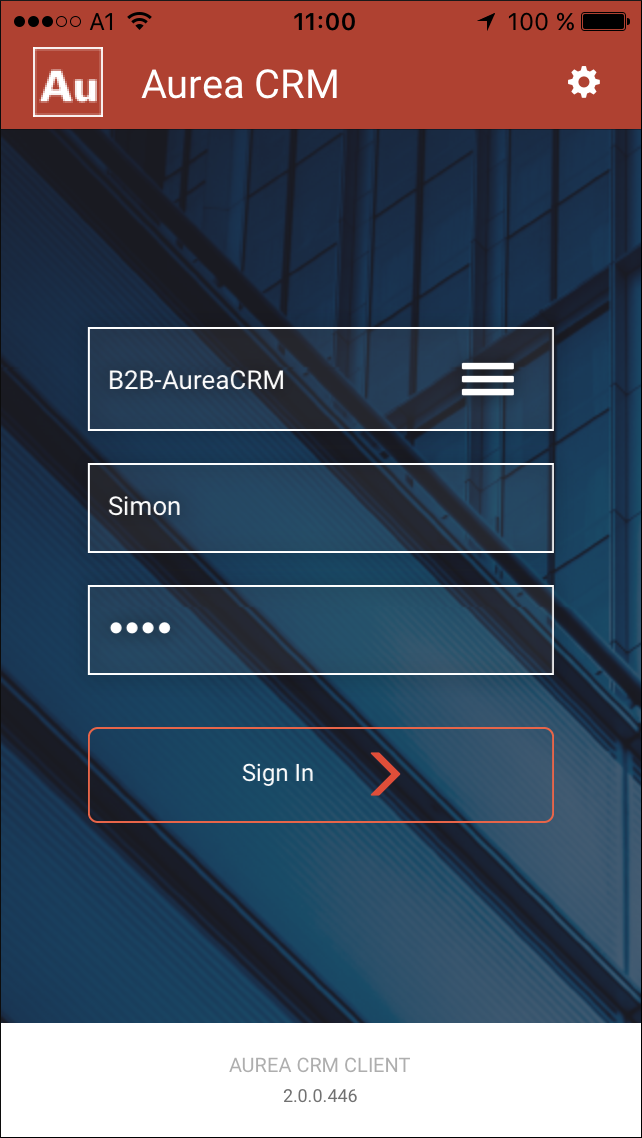
Responsive Login Screen
The login screen for large resolutions with a maximum width of 750 pixels is shows below:
The following screenshot shows the login screen for smaller resolutions:
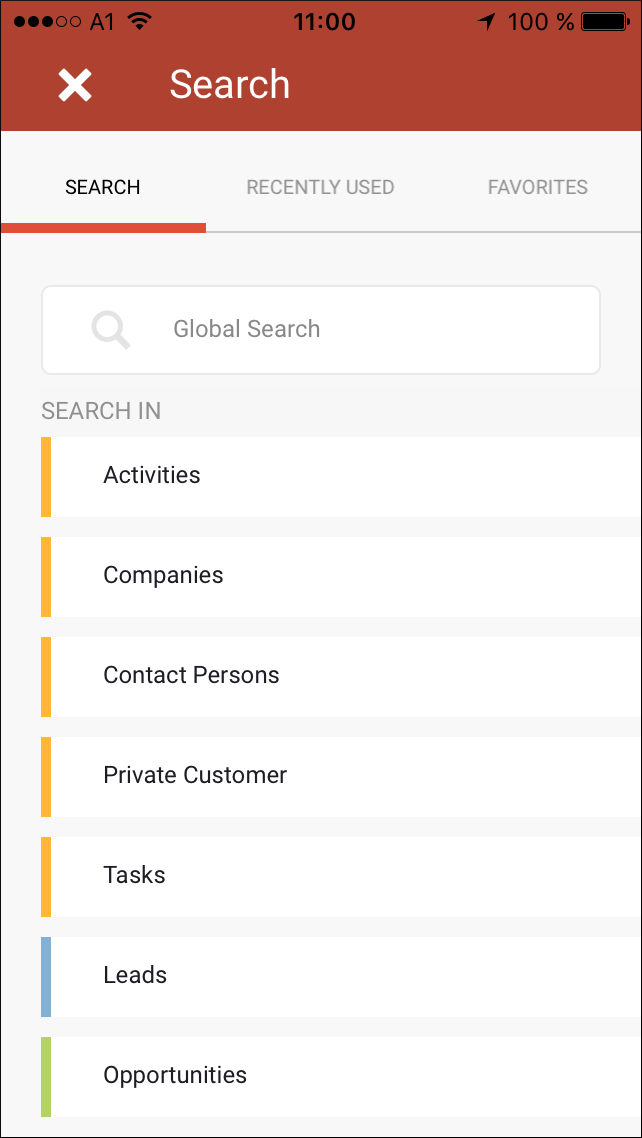
Responsive Search Bar
For larger screen resolutions the Search panel overlays the underlying window up to a maximum width of 750 pixels after which part of the underlying panel is visible:
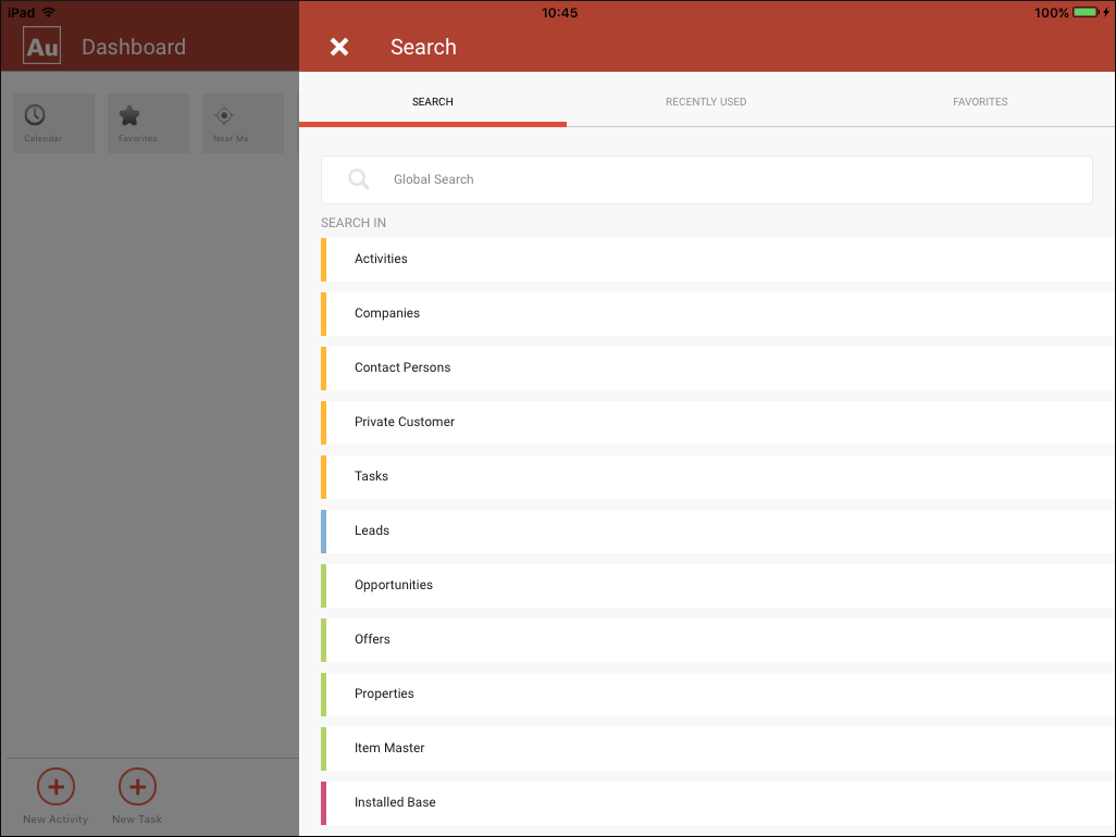
For smaller screen resolutions the Search panel overlays the underlying window, see the screenshot below:
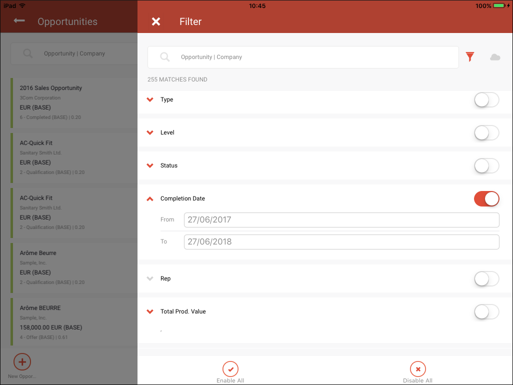
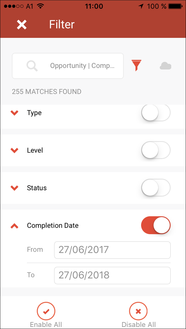
Responsive Filters
For larger screen resolutions the Filter panel overlays the underlying window up to a maximum width of 750 pixels after which part of the underlying panel is visible:
For smaller screen resolutions the Search panel overlays the underlying window, see the screenshot below:
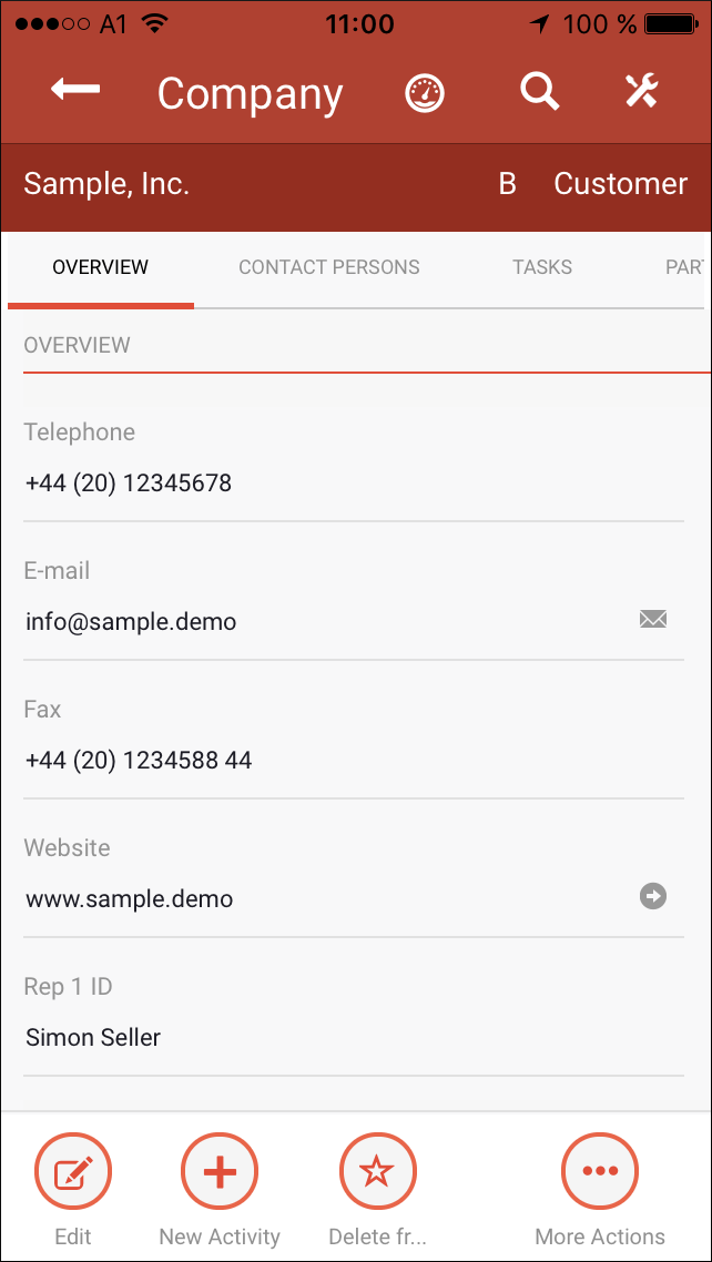
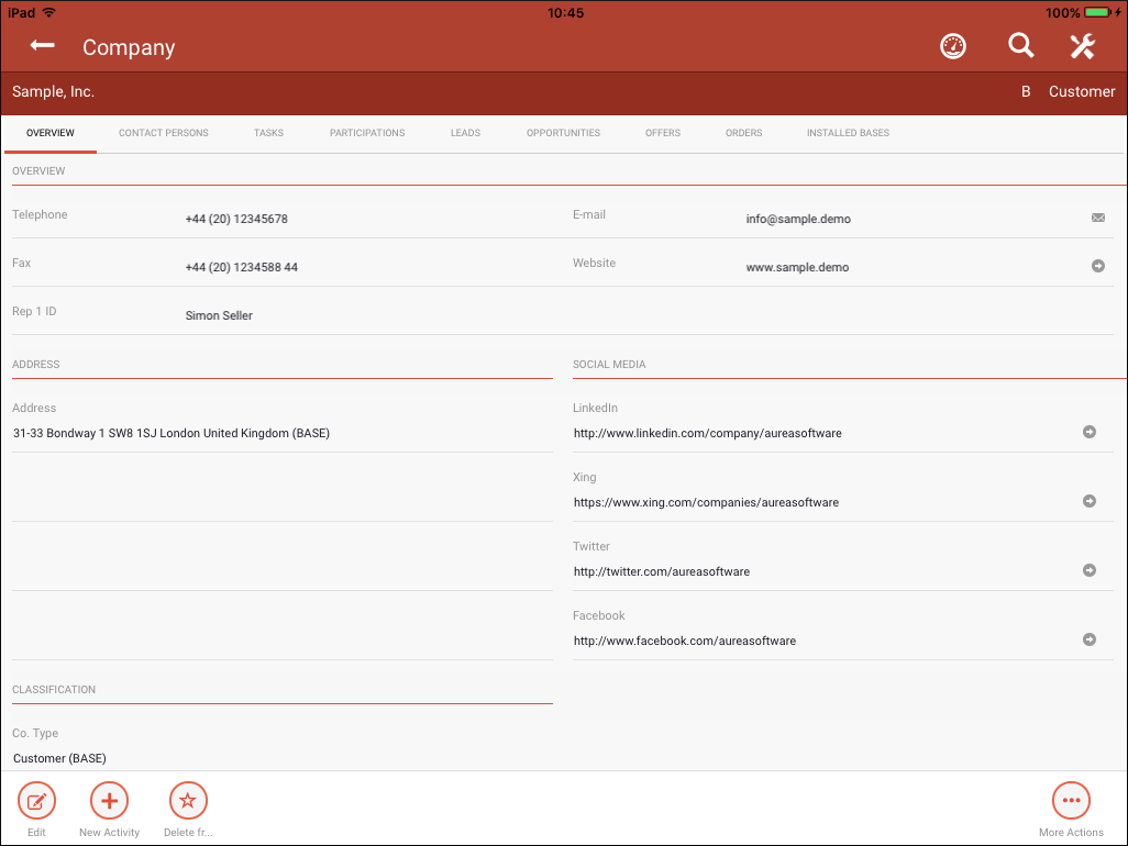
Responsive Details View
For larger screen resolutions the Details View shows the fields in two columns:
For smaller screen resolutions the Details view shows the fields in a single column: