Configuring the Toolbar Layout
Learn how to configure the toolbar layout, icons and keyboard shortcuts.
You can change the font size, font style, width and alignment used by text fields. You can also assign your own icons to the standard functions in CRM.phone and can assign keyboard shortcuts to buttons.
You can define which controls (buttons, text fields etc.) are displayed in the toolbar. User-defined controls saved in a controls format can also be added to the toolbar. For further details, see Defining General Control Elements.
You can also determine the order in which elements in a row (text fields, buttons, separators) are displayed in the toolbar. You can choose to display the toolbar over two rows.
If the toolbar uses two rows, both rows are automatically set to the same height. The height is set according to the height of the largest element. For example, if one row contains a dual line text field, the second row is also adjusted according to the height of the dual line text field.
Formatting Text Fields
To format a text field:
- Switch to the Text
Fields tab in the CRM.phone
Toolbar Layout dialog.

- Select one of the fields listed under Text Fields.
- Define the Text Field Properties
for the selected field:
- Font size (pt)
- Field width (pixels)
- Font style(Bold, Italic)
-
Alignment (Left-aligned,
Centered, Right-aligned)
The selected text is displayed using the selected formatting in update.CRM.
Changing Icons used by Standard Functions
To assign an icon:
- Switch to the Default
icons tab in the CRM.phone
Toolbar Layoutdialog.

The Available Default Buttons are listed.
- By default, three designs are available for the default buttons:
-
 (Default Layout
web)
(Default Layout
web) -
 (Default Layout
win)
(Default Layout
win)Click on the icon representing the desired design. If you edit these icons, the previously used icons are overwritten.
-
- Select one of the Available Default Buttons from the list. The current icon is displayed under Choose bitmap.
- To select a new icon, click on
 (Load Bitmap) and select the icon to be used by the
corresponding button. You can select a default icon available in CRM.phone or load
your own icon from a file. Click on (Load) next to the Load from file field to add a new
icon from a file. If the icon you load from the file is larger than the default icon,
the icon is cropped in update.CRM web, i. e. only a part fitting the default icon's
size is displayed.Note: Icons loaded from a file are added to the format. If you change the icon in the file itself, the change is not automatically applied to the format. To update the icon in the format, upload the icon again.
(Load Bitmap) and select the icon to be used by the
corresponding button. You can select a default icon available in CRM.phone or load
your own icon from a file. Click on (Load) next to the Load from file field to add a new
icon from a file. If the icon you load from the file is larger than the default icon,
the icon is cropped in update.CRM web, i. e. only a part fitting the default icon's
size is displayed.Note: Icons loaded from a file are added to the format. If you change the icon in the file itself, the change is not automatically applied to the format. To update the icon in the format, upload the icon again. - Click on (Default
Bitmap) to revert to the default CRM.phone icon.Note: If you click on one of the design buttons in the Available Default Buttons ( (Default Layout
web) or (Default Layout win), the corresponding default
icons are assigned to all functions listed.
Assigning Keyboard Shortcuts
To assign a keyboard shortcut:
- Switch to the Keyboard
shortcuts tab in the CRM.phone
Toolbar Layout dialog.

- Select the entry you want to assign a shortcut to from the list of Available Buttons.
- Click in the Enter shortcut field.
- Press the desired shortcut combination.
If the shortcut is already assigned, the entry the shortcut is assigned to is displayed next to Currently assigned to :.
- Click on
 (Assign
Shortcut) to assign the shortcut to the selected entry.
(Assign
Shortcut) to assign the shortcut to the selected entry. - Click on
 (Delete
Shortcut) to delete the selected shortcut. Click on
(Delete
Shortcut) to delete the selected shortcut. Click on  (Delete All
Shortcuts) to remove all assigned shortcuts.Note: Users can define their own shortcuts in the Customize Keyboard dialog. If the same shortcut combination has been defined (for different functions) both here and in the Customize Keyboard dialog, the user-specific shortcut takes precedence (the settings defined in the telephone profile are ignored).
(Delete All
Shortcuts) to remove all assigned shortcuts.Note: Users can define their own shortcuts in the Customize Keyboard dialog. If the same shortcut combination has been defined (for different functions) both here and in the Customize Keyboard dialog, the user-specific shortcut takes precedence (the settings defined in the telephone profile are ignored).
Configuring which Elements are Displayed
To add or remove elements to and from the toolbar:
- Switch to the Lines tab in the CRM.phone
Toolbar Layout dialog.
The elements assigned to the currently selected row are listed under Row Elements.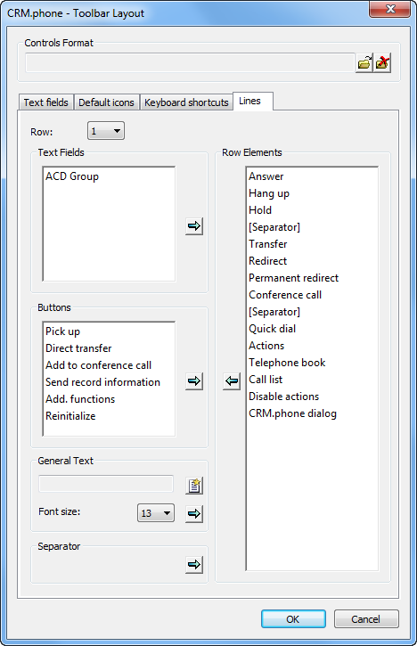
- If you want to add your own controls stored in a controls format, you need to load
the format. For further details, see Loading
Controls Formats.
The available elements in the format are listed under Text Fields and Buttons.
- Select an element from the Text
Fields or Buttons list, and click on
 (Add Text
Field/Button).
(Add Text
Field/Button).The element is added to the end of the Row Elements list. Drag it to the desired position. For further details, see Configuring the Order of Elements in a Row.
- To add specific text before a field (e.g. to display tips or describe a control
element or group of elements):
- Click on
 (New Text) in the General Text pane.
 - Enter the desired text in the Edit Text dialog.
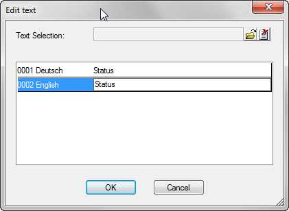 Note: You cannot only enter space characters (e.g. to space elements in the toolbar). To space elements, see Spacing Elements.
 - Click on OK.
- Select the desired Font size.
- Click on
- If you want to add a separator to group similar items:
- Click on (Add Separator) under Separator.
- Move the entry to the desired position. For further
details, see Configuring the Order of Elements in a Row.
A separator (
 ) is displayed in the
toolbar at the defined position.
) is displayed in the
toolbar at the defined position.
- Click on
- To remove a control element from the toolbar, select the desired entry and click on
 (Remove
Element).
(Remove
Element).Elements that have been removed are listed under either Text Fields or Buttons, depending on the type of element.
Separators and text elements are simply deleted.
Configuring the Order of Elements in a Row
To change the order of elements:
Click on the entry you wish to move and drag it to the position of the entry that it should appear before in the toolbar.
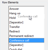
The entry you are moving remains highlighted at its original position until you release the mouse button.
Displaying the Toolbar Using Two Rows
To display the toolbar over two rows:
- Before you can assign controls to the second
row, they need to be removed from the first row. Switch to Row 1, select the desired element and click on
(Remove
Element). Depending on the type of element, it is moved to
either the Text Fields or Buttons list.
Separators and general texts are removed.
- If you want to add controls you have defined your self, you need to load the
corresponding controls format. For further details, see Loading Controls Formats.
The available elements in the format are listed under Text Fields and Buttons.
- Select Row 2.
The Row Elements list is updated to reflect the elements in the second row. By default, the second row is empty.
- Select the element you want to add to the second row in the Text Fields or Buttons list, and click on (Add Text
Field/Button).
The element is added to end of the list of Row Elements. Drag the element to the desired position. For further details, see Configuring the Order of Elements in a Row.
You can add controls from a controls format, see Loading Controls Formats.