Handling dark or all white images
Dark or all white images may not look great on all web parts.
Our web parts often show an image in the background with text on top. In order to do this, we apply a gradient to the bottom of the image so that we can overlay white text on top of it. If you have darker or all white images, then the tint may drown out the image.
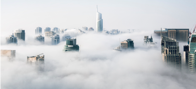
For example, below is an image that you want to use for a news story header:
Image for news story header
The image contains a lot of white so when this is placed on the page it looks like this.

Image with clear text
Image with unclear text
In general, it is recommend that you use images with lots of color and to make sure that they look good on pages when you upload them.
Look at some of the below examples of how amazing images on page headers can look in Bonzai Intranet:


