Expand configuration
The expand configuration of an info area contains the field group and header group that configure the Details view of a record.
In CRM.mobile two types of Details views are available:
- the Details Overview provides an overview of a record's contents using tiles. For further details, see Details overview.
- the tabular Details view lists field values of a record line by line. For further details, see Tabular details view.
Both views may contain Quick Actions, Extended Actions and sub-lists listing child records. For further details, see Related data area.
Users can switch between views by tapping the  /
/  buttons or the header text (Overview/Details).
The default view is the tabular Details view, i.e. if no Details Overview is configured for an info area, the tabular Details view is displayed and the arrow buttons are hidden.
The following options are available:
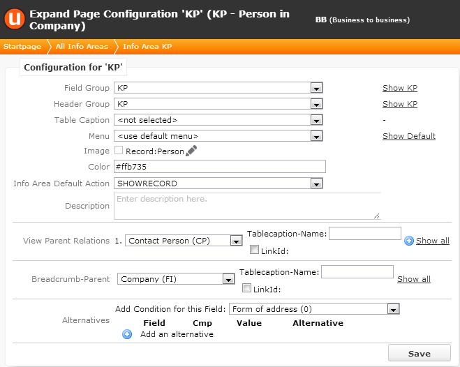
- Field Group: Defines which Details control is used.
-
Header Group: Defines which
ExpandandExpand.QuickActionsheader is used. - Table Caption: Defines the record's table caption.
- Color: The info area's color. Used for Record tiles, in lists and on Details views. If undefined, light gray is used.
- Info Area Default Action: Defines the default action that is executed when a user taps on a link (e.g. in a header). For further details, see Default action.
-
Breadcrumb-Parent: Only the
direct parent of the record is shown in CRM.mobile, no parents of the parent. Tapping on
the link opens the Details view of the parent record using the info area's default field
group
<infoAreaId>.Use LinkId to specify another than the default link.
The following chapters describe how these settings are used by the Details Overview and the tabular Details view.