Quick actions
Quick Actions allow users to quickly access context-specific functions like calling a phone number or adding a record.

Quick Actions are buttons configured in special headers *.QuickActions.
Quick Actions can be defined:
- for pages that use the
Tilesaction (in theactionsparameter), e.g.Home.QuickActionsforA_Tiles:Home. - for Details and Details Overview pages by configuring a special header
Expand.QuickActionsin the header group referenced in the info area's Expand configuration, e.g.Expand.QuickActionsfrom header groupFIfor the Company Details Overview.
You can configure max. three buttons at most. Additional buttons are ignored, i.e. not displayed.
If less than three buttons are defined, they are displayed left-aligned. If no Quick Actions are defined, the Quick Actions bar is hidden.
If a Quick Action requires a field value, e.g. the e-mail address of the record, and the current record does not contain that value, the Quick Action is hidden.
You can define any button to be used as a Quick Action. Make sure you only use buttons that make sense in the context, i.e. do not use a button that needs a record ID (e.g. MakeCall) on the Home tab.
Configuring a quick action
You can configure label, image, action, and CRM processes as quick actions.
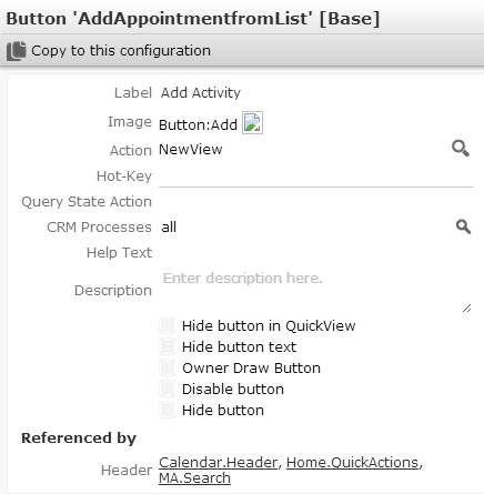
You can configure the following settings for buttons used as Quick Actions:
- Label:
The label to be displayed on the button (max. 2 lines). You can specify any text
and/or use placeholders. For further details, see Placeholders. Long texts
are truncated (browser-dependent).
If all placeholders specified in a button label evaluate to empty, the button is hidden, e.g. if a company record does not contain a phone number, the
MakeCallbutton is not available for that record.You can define an alternate button to be displayed instead of such an "empty" button by adding a
$AlternateButtonargument to the button's action definition. For further details, see Alternate Buttons.If a label contains only text or if the specified placeholder is not defined in the
<infoAreaID>:Placeholdersfield group used in the current context, the button is always enabled although it may do nothing. - Image: Select an image to be displayed on the button. The images must be registered in CRM.designer. For further details, see Images
- Action: Define the action to be executed. For further details,
see Action templates. You can
provide values of input arguments by using placeholders. For further details,
see Placeholders.
For a list of buttons defined in update.tablet. For further details, see Standard buttons.
- CRM Processes: Assign one or more CRM processes to the button. For further details, see Assigning CRM Processes in the Aurea.CRM Web Administrator Guide.